How To Build A Multilingual Website With Nuxt.js

This article is a sponsored by

Internationalization, often abbreviated as i18n, is the process of designing and developing software applications in a way that they can be easily adapted to various spoken languages like English, German, French, and more without requiring substantial changes to the codebase. It involves moving away from hardcoded strings and techniques for translating text, formatting dates and numbers, and handling different character encodings, among other tasks.

Internationalization can give users the choice to access a given website or application in their native language, which can have a positive impression on them, making it crucial for reaching a global audience.

What We’re Making

In this tutorial, we’re making a website that puts these i18n pieces together using a combination of libraries and a UI framework. You’ll want to have intermediate proficiency with JavaScript, Vue, and Nuxt to follow along. Throughout this article, we will learn by examples and incrementally build a multilingual Nuxt website. Together, we will learn how to provide i18n support for different languages, lazy-load locale messages, and switch locale on runtime.

After that, we will explore features like interpolation, pluralization, and date/time translations.

And finally, we will fetch dynamic localized content from an API server using Hygraph as our API server to get localized content. If you do not have a Hygraph account before jumping in.

As a final detail, we will use as our UI framework, but please feel free to use another framework if you want. The final code for what we’re building is published in a for reference. And finally, you can also take a look at the final result .

The nuxt-i18n Library

is a library for implementing internationalization in Nuxt.js applications, and it’s what we will be using in this tutorial. The library is built on top of , which, again, is the de facto standard library for implementing i18n in Vue applications.

What makes nuxt-i18n ideal for our work is that it provides the comprehensive set of features included in Vue I18n while adding more functionalities that are specific to Nuxt, like lazy loading locale messages, route generation and redirection for different locales, SEO metadata per locale, locale-specific domains, and more.

Initial Setup

Start a new Nuxt.js project and set it up with a UI framework of your choice. Again, I will be using Vue to establish the interface for this tutorial.

Let us add a basic layout for our website and set up some sample Vue templates.

First, a “Blog” page:

<!-- pages/blog.vue -->
<template>
  <div>
    <v-card color="cardBackground">
      <v-card-title class="text-overline">
        Home
      </v-card-title>
      <v-card-text>
        This is the home page description
      </v-card-text>
    </v-card>
  </div>
</template>

Next, an “About” page:

<!-- pages/about.vue -->
<template>
  <div>
    <v-card color="cardBackground">
      <v-card-title class="text-overline">
        About
      </v-card-title>
      <v-card-text>
        This is the about page description
      </v-card-text>
    </v-card>
  </div>
</template>

This gives us a bit of a boilerplate that we can integrate our i18n work into.

Translating Plain Text

The page templates look good, but notice how the text is hardcoded. As far as i18n goes, hardcoded content is difficult to translate into different locales. That is where the nuxt-i18n library comes in, providing the language-specific strings we need for the Vue components in the templates.

We’ll start by installing the library via the command line:

npx nuxi@latest module add i18n

Inside the nuxt.config.ts file, we need to ensure that we have @nuxtjs/i18n inside the modules array. We can use the i18n property to provide module-specific configurations.

// nuxt.config.ts
export default defineNuxtConfig({
  // ...
  modules: [
    ...
    "@nuxtjs/i18n",
    // ...
  ],
  i18n: {
    // nuxt-i18n module configurations here
  }
  // ...
});

Since the nuxt-i18n library is built on top of the Vue I18n library, we can utilize its features in our Nuxt application as well. Let us create a new file, i18n.config.ts, which we will use to provide all vue-i18n configurations.

// i18n.config.ts
export default defineI18nConfig(() => ({
  legacy: false,
  locale: "en",
  messages: {
    en: {
      homePage: {
        title: "Home",
        description: "This is the home page description."
      },
      aboutPage: {
        title: "About",
        description: "This is the about page description."
      },
    },
  },
}));

Here, we have specified internationalization configurations, like using the en locale, and added messages for the en locale. These messages can be used inside the markup in the templates we made with the help of a $t function from Vue I18n.

Next, we need to link the i18n.config.ts configurations in our Nuxt config file.

// nuxt.config.ts
export default defineNuxtConfig({
  ...
  i18n: {
    vueI18n: "./i18n.config.ts"
  }
  ...
});

Now, we can use the $t function in our components — as shown below — to parse strings from our internationalization configurations.

Note: There’s no need to import $t since we have Nuxt’s default auto-import functionality.

<!-- i18n.config.ts -->
<template>
  <div>
    <v-card color="cardBackground">
      <v-card-title class="text-overline">
        {{ $t("homePage.title") }}
      </v-card-title>
      <v-card-text>
        {{ $t("homePage.description") }}
      </v-card-text>
    </v-card>
  </div>
</template>

Lazy Loading Translations

We have the title and description served from the configurations. Next, we can add more languages to the same config. For example, here’s how we can establish translations for English (en), French (fr) and Spanish (es):

// i18n.config.ts
export default defineI18nConfig(() => ({
  legacy: false,
  locale: "en",
  messages: {
    en: {
      // English
    },
    fr: {
      // French
    },
    es: {
      // Spanish
    }
  },
}));

For a production website with a lot of content that needs translating, it would be unwise to bundle all of the messages from different locales in the main bundle. Instead, we should use the nuxt-i18 lazy loading feature asynchronously load only the required language rather than all of them at once. Also, having messages for all locales in a single configuration file can become difficult to manage over time, and breaking them up like this makes things easier to find.

Let’s set up the lazy loading feature in nuxt.config.ts:

// etc.
  i18n: {
    vueI18n: "./i18n.config.ts",
    lazy: true,
    langDir: "locales",
    locales: [
      {
        code: "en",
        file: "en.json",
        name: "English",
      },
      {
        code: "es",
        file: "es.json",
        name: "Spanish",
      },
      {
        code: "fr",
        file: "fr.json",
        name: "French",
      },
    ],
    defaultLocale: "en",
    strategy: "no_prefix",
  },

// etc.

This enables lazy loading and specifies the locales directory that will contain our locale files. The locales array configuration specifies from which files Nuxt.js should pick up messages for a specific language.

Now, we can create individual files for each language. I’ll drop all three of them right here:


// locales/en.json
{
  "homePage": {
    "title": "Home",
    "description": "This is the home page description."
  },
  "aboutPage": {
    "title": "About",
    "description": "This is the about page description."
  },
  "selectLocale": {
    "label": "Select Locale"
  },
  "navbar": {
    "homeButton": "Home",
    "aboutButton": "About"
  }
}
// locales/fr.json
{
  "homePage": {
    "title": "Bienvenue sur la page d'accueil",
    "description": "Ceci est la description de la page d'accueil."
  },
  "aboutPage": {
    "title": "À propos de nous",
    "description": "Ceci est la description de la page à propos de nous."
  },
  "selectLocale": {
    "label": "Sélectionner la langue"
  },
  "navbar": {
    "homeButton": "Accueil",
    "aboutButton": "À propos"
  }
}
// locales/es.json
{
  "homePage": {
    "title": "Bienvenido a la página de inicio",
    "description": "Esta es la descripción de la página de inicio."
  },
  "aboutPage": {
    "title": "Sobre nosotros",
    "description": "Esta es la descripción de la página sobre nosotros."
  },
  "selectLocale": {
    "label": "Seleccione el idioma"
  },
  "navbar": {
    "homeButton": "Inicio",
    "aboutButton": "Acerca de"
  }
}

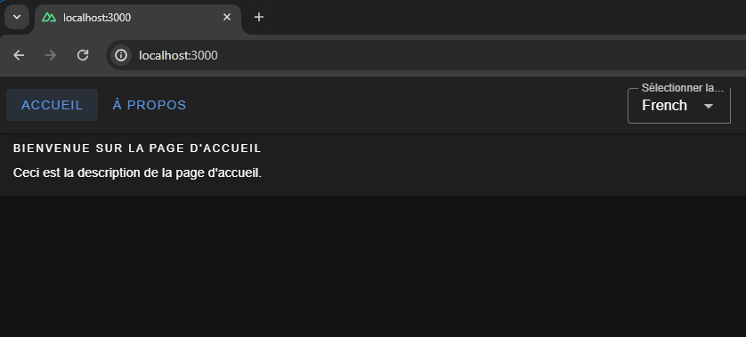
We have set up lazy loading, added multiple languages to our application, and moved our locale messages to separate files. The user gets the right locale for the right message, and the locale messages are kept in a maintainable manner inside the code base.

Switching Between Languages

We have different locales, but to see them in action, we will build a component that can be used to switch between the available locales.

<!-- components/select-locale.vue -->
<script setup>
const { locale, locales, setLocale } = useI18n();

const language = computed({
  get: () => locale.value,
  set: (value) => setLocale(value),
});
</script>

<template>
  <v-select
    :label="$t('selectLocale.label')"
    variant="outlined"
    color="primary"
    density="compact"    
    :items="locales"
    item-title="name"
    item-value="code"
    v-model="language"
  ></v-select>
</template>

This component uses the useI18n hook provided by the Vue I18n library and a computed property language to get and set the global locale from a <select> input. To make this even more like a real-world website, we’ll include a small navigation bar that links up all of the website’s pages.

<!-- components/select-locale.vue -->
<template>
  <v-app-bar app :elevation="2" class="px-2">
    <div>
      <v-btn color="button" to="/">
        {{ $t("navbar.homeButton") }}
      </v-btn>
      <v-btn color="button" to="/about">
        {{ $t("navbar.aboutButton") }}
      </v-btn>
    </div>
    <v-spacer />
    <div class="mr-4 mt-6">
      <SelectLocale />
    </div>
  </v-app-bar>
</template>

That’s it! Now, we can switch between languages on the fly.

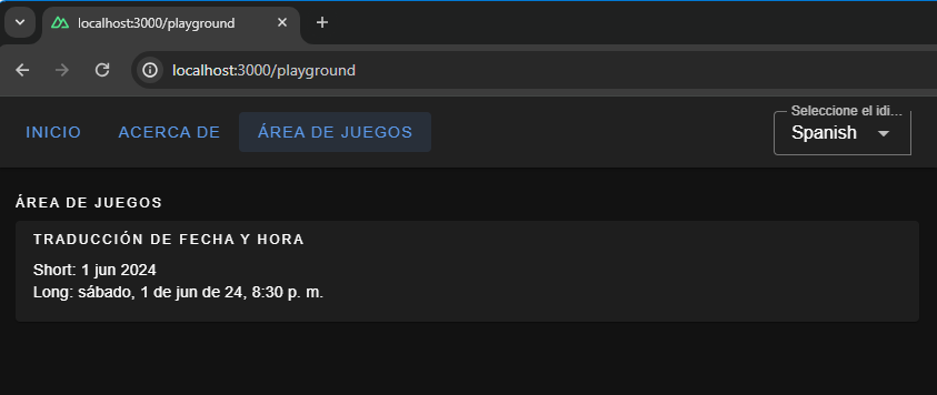
We have a basic layout, but I thought we’d take this a step further and build a playground page we can use to explore more i18n features that are pretty useful when building a multilingual website.

Interpolation and Pluralization

Interpolation and pluralization are internationalization techniques for handling dynamic content and grammatical variations across different languages. Interpolation allows developers to insert dynamic variables or expressions into translated strings. Pluralization addresses the complexities of plural forms in languages by selecting the appropriate grammatical form based on numeric values. With the help of interpolation and pluralization, we can create more natural and accurate translations.

To use pluralization in our Nuxt app, we’ll first add a configuration to the English locale file.

// locales/en.json
{
  // etc.
  "playgroundPage": {
    "pluralization": {
      "title": "Pluralization",
      "apple": "No Apple | One Apple | {count} Apples",
      "addApple": "Add"
    }
  }
  // etc.
}

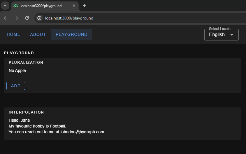
The pluralization configuration set up for the key apple defines an output — No Apple — if a count of 0 is passed to it, a second output — One Apple — if a count of 1 is passed, and a third — 2 Apples, 3 Apples, and so on — if the count passed in is greater than 1.

Here is how we can use it in your component: Whenever you click on the add button, you will see pluralization in action, changing the strings.

<!-- pages/playground.vue -->
<script setup>
let appleCount = ref(0);
const addApple = () => {
  appleCount.value += 1;
};
</script>
<template>
  <v-container fluid>
    <!-- PLURALIZATION EXAMPLE  -->
    <v-card color="cardBackground">
      <v-card-title class="text-overline">
        {{ $t("playgroundPage.pluralization.title") }}
      </v-card-title>

      <v-card-text>
        {{ $t("playgroundPage.pluralization.apple", { count: appleCount }) }}
      </v-card-text>
      <v-card-actions>
        <v-btn
          @click="addApple"
          color="primary"
          variant="outlined"
          density="comfortable"
          >{{ $t("playgroundPage.pluralization.addApple") }}</v-btn
        >
      </v-card-actions>
    </v-card>
  </v-container>
</template>

To use interpolation in our Nuxt app, first, add a configuration in the English locale file:

// locales/en.json
{
  ...
  "playgroundPage": {
    ... 
    "interpolation": {
      "title": "Interpolation",
      "sayHello": "Hello, {name}",
      "hobby": "My favourite hobby is {0}.",
      "email": "You can reach out to me at {account}{'@'}{domain}.com"
    },
    // etc. 
  }
  // etc.
}

The message for sayHello expects an object passed to it having a key name when invoked — a process known as .

The message hobby expects an array to be passed to it and will pick up the 0th element, which is known as .

The message email expects an object with keys account, and domain and joins both with a literal string "@". This is known as .

Below is an example of how to use it in the Vue components:

<!-- pages/playground.vue -->
<template>
  <v-container fluid>
    <!-- INTERPOLATION EXAMPLE  -->
    <v-card color="cardBackground">
      <v-card-title class="text-overline">
        {{ $t("playgroundPage.interpolation.title") }}
      </v-card-title>
      <v-card-text>
        <p>
          {{
            $t("playgroundPage.interpolation.sayHello", {
              name: "Jane",
            })
          }}
        </p>
        <p>
          {{
            $t("playgroundPage.interpolation.hobby", ["Football", "Cricket"])
          }}
        </p>
        <p>
          {{
            $t("playgroundPage.interpolation.email", {
              account: "johndoe",
              domain: "hygraph",
            })
          }}
        </p>
      </v-card-text>
    </v-card>
  </v-container>
</template>
Date & Time Translations

Translating dates and times involves translating date and time formats according to the conventions of different locales. We can use Vue I18n’s features for formatting date strings, handling time zones, and translating day and month names for managing date time translations. We can give the configuration for the same using the datetimeFormats key inside the vue-i18n config object.

// i18n.config.ts
export default defineI18nConfig(() => ({
  fallbackLocale: "en",
  datetimeFormats: {
    en: {
      short: {
        year: "numeric",
        month: "short",
        day: "numeric",
      },
      long: {
        year: "numeric",
        month: "short",
        day: "numeric",
        weekday: "short",
        hour: "numeric",
        minute: "numeric",
        hour12: false,
      },
    },
    fr: {
      short: {
        year: "numeric",
        month: "short",
        day: "numeric",
      },
      long: {
        year: "numeric",
        month: "short",
        day: "numeric",
        weekday: "long",
        hour: "numeric",
        minute: "numeric",
        hour12: true,
      },
    },
    es: {
      short: {
        year: "numeric",
        month: "short",
        day: "numeric",
      },
      long: {
        year: "2-digit",
        month: "short",
        day: "numeric",
        weekday: "long",
        hour: "numeric",
        minute: "numeric",
        hour12: true,
      },
    },
  },
}));

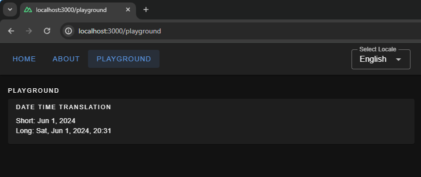
Here, we have set up short and long formats for all three languages. If you are coding along, you will be able to see available configurations for fields, like month and year, thanks to TypeScript and Intellisense features provided by your code editor. To display the translated dates and times in components, we should use the $d function and pass the format to it.

<!-- pages.playground.vue -->
<template>
  <v-container fluid>
    <!-- DATE TIME TRANSLATIONS EXAMPLE  -->
    <v-card color="cardBackground">
      <v-card-title class="text-overline">
        {{ $t("playgroundPage.dateTime.title") }}
      </v-card-title>
      <v-card-text>
        <p>Short: {{ (new Date(), $d(new Date(), "short")) }}</p>
        <p>Long: {{ (new Date(), $d(new Date(), "long")) }}</p>
      </v-card-text>
    </v-card>
  </v-container>
</template>
Localization On the Hygraph Side

We saw how to implement localization with static content. Now, we’ll attempt to understand how to fetch dynamic localized content in Nuxt.

We can build a blog page in our Nuxt App that fetches data from a server. The server API should accept a locale and return data in that specific locale.

Hygraph has a flexible localization API that allows you to publish and query localized content. If you haven’t created a free Hygraph account yet, to continue following along.

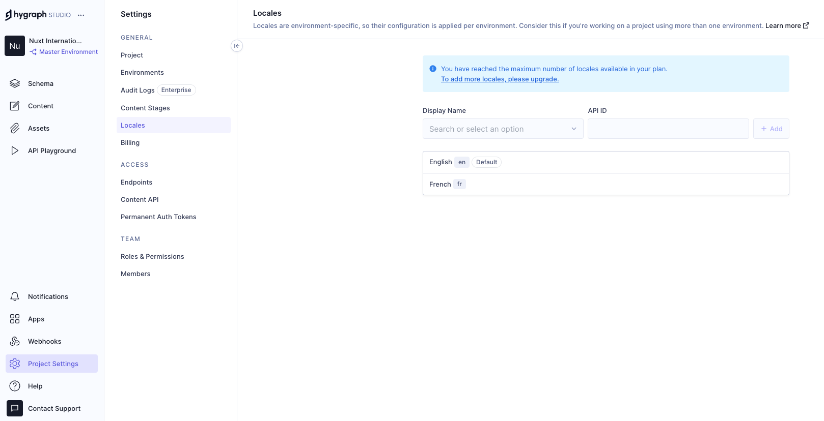
Go to Project SettingsLocales and add locales for the API.

We have added two locales: English and French. Now we need aq localized_post model in our schema that only two fields: title and body. Ensure to make these “Localized” fields while creating them.
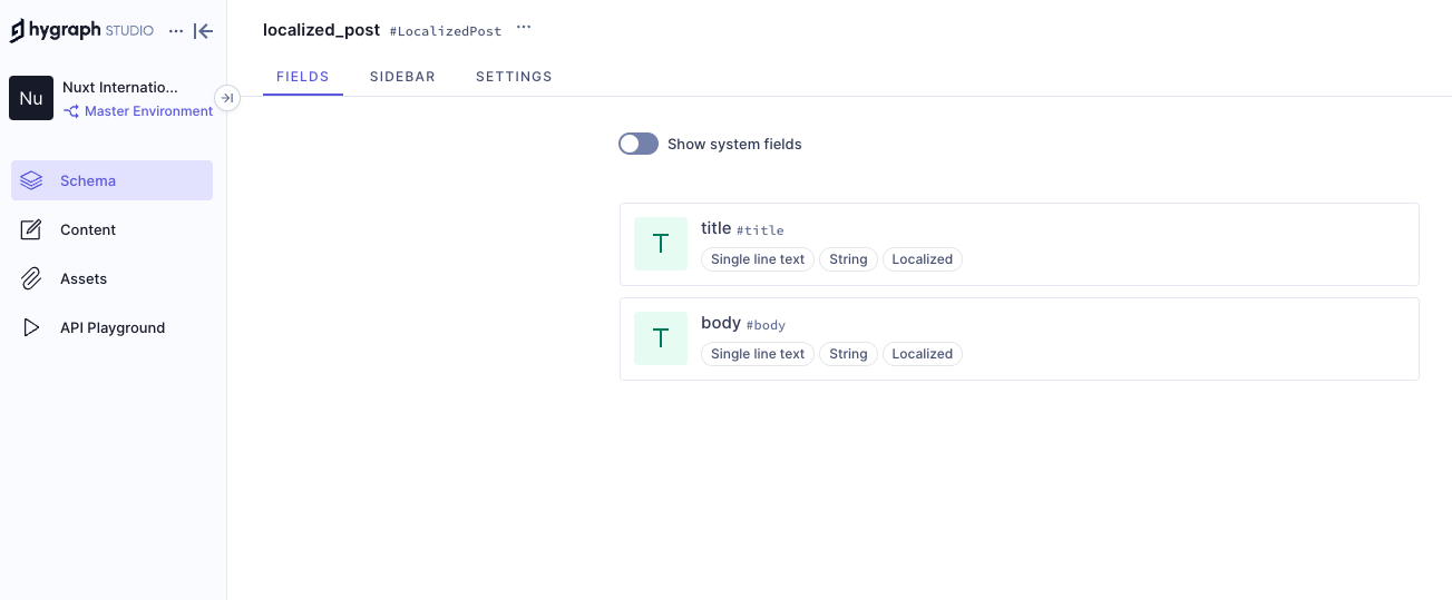
Add permissions to consume the localized content, go to Project settingsAccessAPI AccessPublic Content API, and assign Read permissions to the localized_post model.
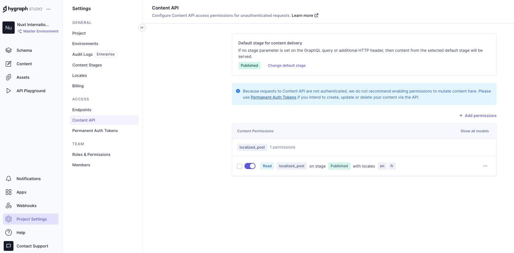
Now, we can go to the and add some localized data to the database with the help of GraphQL mutations. To limit the scope of this example, I am simply adding data from the Hygraph API playground. In an ideal world, a create/update mutation would be triggered from the front end after receiving user input.

Run this mutation in the Hygraph API playground:

mutation createLocalizedPost {
  createLocalizedPost(
    data: {
      title: "A Journey Through the Alps", 
      body: "Exploring the majestic mountains of the Alps offers a thrilling experience. The stunning landscapes, diverse wildlife, and pristine environment make it a perfect destination for nature lovers.", 
      localizations: {
        create: [
          {locale: fr, data: {title: "Un voyage à travers les Alpes", body: "Explorer les majestueuses montagnes des Alpes offre une expérience palpitante. Les paysages époustouflants, la faune diversifiée et l'environnement immaculé en font une destination parfaite pour les amoureux de la nature."}}
        ]
      }
    }
  ) {
    id
  }
}

The mutation above creates a post with the en locale and includes a fr version of the same post. Feel free to add more data to your model if you want to see things work from a broader set of data.

Putting Things Together

Now that we have Hygraph API content ready for consumption let’s take a moment to understand how it’s consumed inside the Nuxt app.

To do this, we’ll install to serve as the app’s GraphQL client. This is a minimal GraphQL client for performing GraphQL operations without having to worry about complex configurations, code generation, typing, and other setup tasks.

npx nuxi@latest module add graphql-client
// nuxt.config.ts
export default defineNuxtConfig({
  modules: [
    // ...
    "nuxt-graphql-client"
    // ...
  ],
  runtimeConfig: {
    public: {
      GQL_HOST: 'ADD_YOUR_GQL_HOST_URL_HERE_OR_IN_.env'
    }
  },
});

Next, let’s add our GraphQL queries in graphql/queries.graphql.

query getPosts($locale: [Locale!]!) {
  localizedPosts(locales: $locale) {
    title
    body
  }
}

The GraphQL client will automatically scan .graphql and .gql files and generate client-side code and typings in the .nuxt/gql folder. All we need to do is stop and restart the Nuxt application. After restarting the app, the GraphQL client will allow us to use a GqlGetPosts function to trigger the query.

Now, we will build the Blog page where by querying the Hygraph server and showing the dynamic data.

// pages/blog.vue
<script lang="ts" setup>
  import type { GetPostsQueryVariables } from "#gql";
  import type { PostItem, Locale } from "../types/types";

  const { locale } = useI18n();
  const posts = ref<PostItem[]>([]);
  const isLoading = ref(false);
  const isError = ref(false);

  const fetchPosts = async (localeValue: Locale) => {
    try {
      isLoading.value = true;
      const variables: GetPostsQueryVariables = {
        locale: [localeValue],
      };
      const data = await GqlGetPosts(variables);
      posts.value = data?.localizedPosts ?? [];
    } catch (err) {
      console.log("Fetch Error, Something went wrong", err);
      isError.value = true;
    } finally {
      isLoading.value = false;
    }
  };

  // Fetch posts on component mount
  onMounted(() => {
    fetchPosts(locale.value as Locale);
  });

  // Watch for locale changes
  watch(locale, (newLocale) => {
    fetchPosts(newLocale as Locale);
  });
</script>

This code fetches only the current locale from the useI18n hook and sends it to the fetchPosts function when the Vue component is mounted. The fetchPosts function will pass the locale to the GraphQL query as a variable and obtain localized data from the Hygraph server. We also have a watcher on the locale so that whenever the global locale is changed by the user we make an API call to the server again and fetch posts in that locale.

And, finally, let’s add markup for viewing our fetched data!

<!-- pages/blog.vue -->
<template>
  <v-container fluid>
    <v-card-title class="text-overline">Blogs</v-card-title>
    <div v-if="isLoading">
      <v-skeleton-loader type="card" v-for="n in 2" :key="n" class="mb-4" />
    </div>
    <div v-else-if="isError">
      <p>Something went wrong while getting blogs please check the logs.</p>
    </div>
    <div v-else>
      <div
        v-for="(post, index) in posts"
        :key="post.title || index"
        class="mb-4"
      >
        <v-card color="cardBackground">
          <v-card-title class="text-h6">{{ post.title }}</v-card-title>
          <v-card-text>{{ post.body }}</v-card-text>
        </v-card>
      </div>
    </div>
  </v-container>
</template>

Awesome! If all goes according to plan, then your app should look something like the one in the following video.

Wrapping Up

Check that out — we just made the functionality for translating content for a multilingual website! Now, a user can select a locale from a list of options, and the app fetches content for the selected locale and automatically updates the displayed content.

Did you think that translations would require more difficult steps? It’s pretty amazing that we’re able to cobble together a couple of libraries, hook them up to an API, and wire everything up to render on a page.

Of course, there are other libraries and resources for handling internationalization in a multilingual context. The exact tooling is less the point than it is seeing what pieces are needed to handle dynamic translations and how they come together.

Sweet Nostalgia In August (2024 Wallpapers Edition)

Everybody loves a beautiful wallpaper to freshen up their desktops and home screens, right? To cater for new and unique artworks on a regular basis, we started our more than 13 years ago, and from the very beginning to today, artists and designers from across the globe have accepted the challenge and submitted their designs to it. Just like this month.

In this post, you’ll find their wallpaper designs for August 2024. All of them come in versions with and without a calendar and can be downloaded for free. As a little bonus goodie, we also added a selection of August favorites from our wallpapers archives that are just too good to be forgotten. A big thank-you to everyone who shared their designs with us this month! Happy August!

  • You can click on every image to see a larger preview,
  • We respect and carefully consider the ideas and motivation behind each and every artist’s work. This is why we give all artists the full freedom to explore their creativity and express emotions and experience through their works. This is also why the themes of the wallpapers weren’t anyhow influenced by us but rather designed from scratch by the artists themselves.

  • Did you know that you could get featured in our next wallpapers post, too? We are always looking for creative talent.

Nostalgia

“August, the final breath of summer, brings with it a wistful nostalgia for a season not yet past.” — Designed by from Romania.

  • with calendar: , , , , , , ,
  • without calendar: , , , , , , ,

Relax In Bora-Bora

“As we have taken a liking to diving through the coral reefs, we’ll also spend August diving and took the leap to Bora-Bora. There we enjoy the sea and nature and above all, we rest to gain strength for the new course that is to come.” — Designed by from Spain.

  • without calendar: , , , , , , , , ,

Sandcastle Day

“Join us on Sandcastle Day for a fun-filled beach adventure, where creativity meets the sand — build, play, and enjoy the sun!” — Designed by from Serbia.

  • with calendar: , , , , , , , , , , , , , , , , , , ,
  • without calendar: , , , , , , , , , , , , , , , , , , ,

Banana!

Designed by from Spain.

  • with calendar: , , , , , , , , , , , , , , , , , , , ,
  • without calendar: , , , , , , , , , , , , , , , , , , , ,

Cullion

Designed by from India.

  • with calendar: , , , , , , ,
  • without calendar: , , , , , , ,

Pirate Aged Rum

Designed by from Spain.

  • with calendar: , , , , , , , , , , , , , , , , , , , ,
  • without calendar: , , , , , , , , , , , , , , , , , , , ,

World Friendship Day

“Cherish the bonds of friendship, share smiles, and create beautiful memories with your friends. Let’s spread love and joy together!” — Designed by from London.

  • with calendar: , , , , , , , , , , , , , , , , , , ,
  • without calendar: , , , , , , , , , , , , , , , , , , ,

Summer Day

Designed by from India.

  • without calendar: , , , , , , ,

Retro Road Trip

“As the sun dips below the horizon, casting a warm glow upon the open road, the retro van finds a resting place for the night. A campsite bathed in moonlight or a cozy motel straight from a postcard become havens where weary travelers can rest, rejuvenate, and prepare for the adventures that await with the dawn of a new day.” — Designed by from Serbia.

  • without calendar: , , , , , , , , , , , , , , , , , , ,

Spooky Campfire Stories

Designed by from Spain.

  • without calendar: , , , , , , , , , , , , , , , , , , , ,

Happiness Happens In August

“Many people find August one of the happiest months of the year because of holidays. You can spend days sunbathing, swimming, birdwatching, listening to their joyful chirping, and indulging in sheer summer bliss. August 8th is also known as the Happiness Happens Day, so make it worthwhile.” — Designed by from Serbia.

  • without calendar: , , , , , , , , , , , , , , , , , , , ,

Bee Happy!

“August means that fall is just around the corner, so I designed this wallpaper to remind everyone to ‘bee happy’ even though summer is almost over. Sweeter things are ahead!” — Designed by Emily Haines from the United States.

  • without calendar: , , , , , , , , , , , , , ,

Colorful Summer

“‘Always keep mint on your windowsill in August, to ensure that the buzzing flies will stay outside where they belong. Don’t think summer is over, even when roses droop and turn brown and the stars shift position in the sky. Never presume August is a safe or reliable time of the year.’ (Alice Hoffman)” — Designed by from Hungary.

  • without calendar: , , , , , , , , ,

Psst, It’s Camping Time…

“August is one of my favorite months, when the nights are long and deep and crackling fire makes you think of many things at once and nothing at all at the same time. It’s about heat and cold which allow you to touch the eternity for a few moments.” — Designed by from Canada.

  • without calendar: , , , , , , , , , , , , , ,

Oh La La… Paris’ Night

“I like the Paris’ night! All is very bright!” — Designed by from Spain.

  • without calendar: , , , , , , , ,

Summer Nap

Designed by from Canada.

  • without calendar: , , , , , , , , , , , , , , , ,

Shrimp Party

“A nice summer shrimp party!” — Designed by from Portugal.

  • without calendar: , , , , , ,

Cowabunga

Designed by from Spain.

  • without calendar: , , , , , , , , , , , , , , , , , , , ,

Childhood Memories

Designed by Francesco Paratici from Australia.

  • without calendar: , , , , , , , , , ,

Live In The Moment

“My dog Sami inspired me for this one. He lives in the moment and enjoys every second with a big smile on his face. I wish we could learn to enjoy life like he does! Happy August everyone!” — Designed by from Portugal.

  • without calendar: , , , , ,

Swimming In The Summer

“It’s the perfect evening and the water is so warm! Can you feel it? You move your legs just a little bit and you feel the water bubbles dancing around you! It’s just you in there, floating in the clean lake and small sparkly lights shining above you! It’s a wonderful feeling, isn’t it?” — Designed by from the Netherlands.

  • without calendar: , , , , , , , , , , , , , , , , , ,

It’s Vacation O’Clock!

“It’s vacation o’clock! Or is it? While we bend our backs in front of a screen, it’s hard not to think about sandy beaches, flipping the pages of a corny book under the umbrella while waves splash continuously. Summer days! So hard to bear them in the city, so pleasant when you’re living the dolce far niente.” — Designed by from the United States.

  • without calendar: , , , , , , , , ,

Launch

“The warm, clear summer nights make me notice the stars more — that’s what inspired this space-themed design!” — Designed by from the United Kingdom.

  • without calendar: , , , , , , , ,

Ahoy

Designed by Webshift 2.0 from South Africa.

  • without calendar: , , , , ,

Rain, Rain Go Away!

“Remember the nursery rhyme where the little boy pleads the rain to go away? It is one of the most pleasant and beautiful seasons when the whole universe buckles up to dance to the rhythm of the drizzles that splash across the earth. And, it is August, the time of the year when monsoons add a lot of color and beauty to nature. We welcome everyone to enjoy the awesomeness of monsoons.” — Designed by from India.

  • without calendar: , , , , , , , , , , , , , , , , , ,

Olympic Summer

“The Summer Olympic Games promise two weeks of superhuman struggle for eternal glory. Support your favorites and enjoy hot August.” — Designed by from Serbia.

  • without calendar: , , , , , , , , , , , , , , , , , , ,

Handwritten August

“I love typography handwritten style.” — Designed by Chalermkiat Oncharoen from Thailand.

  • without calendar: , , , , , , , , , , , , , , , , , , ,

Hello Again

“In Melbourne it is the last month of quite a cool winter so we are looking forward to some warmer days to come.” — Designed by from Australia.

  • without calendar: , , , , , , , , , ,

El Pollo Pepe

“Summer is beach and swimming pool, but it means countryside, too. We enjoy those summer afternoons with our friend ‘El pollo Pepe’. Happy summer!” — Designed by from Spain.

  • without calendar: , , , , , , , , ,

Coffee Break Time

Designed by from Spain.

  • without calendar: , , , , , , , , , , , , , , , , , , , ,

Subtle August Chamomiles

“Our designers wanted to create something summery, but not very colorful, something more subtle. The first thing that came to mind was chamomile because there are a lot of them in Ukraine and their smell is associated with a summer field.” — Designed by from Ukraine.

  • without calendar: , , , , , , , , , , , , , , , , , , , ,

Work Hard, Play Hard

“It seems the feeling of summer breaks we had back in school never leaves us. The mere thought of alarm clocks feels wrong in the summer, especially if you’ve recently come back from a trip to the seaside. So, we try to do our best during working hours and then compensate with fun activities and plenty of rest. Cheers!” — Designed by from the United States.

  • without calendar: , , , , , , , , ,

Rethinking The Role Of Your UX Teams And Move Beyond Firefighting

In my experience of building and supporting UX teams, most of them are significantly under-resourced. In fact, the term “team” can often be a stretch, with many user experience professionals finding themselves alone in their roles.

Typically, there are way more projects that impact the user experience than the team can realistically work on. Consequently, most UX teams are in a constant state of firefighting and achieve relatively little in improving the overall experience.

We can complain about being under-resourced as much as we want, but the truth is that our teams are unlikely to grow to a size where we have sufficient staff to address every detail of the experience. Therefore, in this post, I want to step back and reconsider the role of user experience professionals and how UX teams can best improve the user experience of an organization.

What Is The Role Of A UX Professional?

There is a danger that as UX professionals, we focus too much on the tools of our trade rather than the desired outcome.

In other words, we tend to think that our role involves activities such as:

  • Prototyping
  • User research
  • Interface design
  • Testing with users

But these are merely the means to an end, not the end goal itself. These activities are also time-consuming and resource-intensive, potentially monopolizing the attention of a small UX team.

Our true role is to improve the user experience as they interact with our organization’s digital channels.

The ultimate goal for a UX team should be to tangibly enhance the customer experience, rather than solely focusing on executing design artifacts.

This reframing of our role opens up new possibilities for how we can best serve our organizations and their customers. Instead of solely focusing on the tactical activities of UX, we must proactively identify the most impactful opportunities to enhance the overall customer experience.

Changing How We Approach Our Role

If our goal is to elevate the customer experience, rather than solely executing UX activities, we need to change how we approach our role, especially in under-resourced teams.

To maximize our impact, we must shift from a tactical, project-based mindset to a more strategic, leadership-oriented one.

We need to become experience evangelists who can influence the broader organization and inspire others to prioritize and champion user experience improvements across the business.

As I help shape UX teams in organizations, I achieve this by focusing on four critical areas:

  • ,
  • ,
  • and
  • .

Let’s explore these in turn.

The Creation Of Resources

It is important for any UX team to demonstrate its value to the organization. One way to achieve this is by creating a set of tangible resources that can be utilized by others throughout the organization.

Therefore, when creating a new UX team, I initially focus on establishing a core set of resources that provide value and leave an impressive impression.

Some of the resources I typically focus on producing include:

  • User Experience Playbook
    An online learning resource featuring articles, guides, and cheatsheets that cover topics ranging from conducting surveys to performing AB testing.
  • Design System
    A set of user interface components that can be used by teams to quickly prototype ideas and fast-track their development projects.
  • Recommended Supplier List
    A list of UX specialists that have been vetted by the team, so departments can be confident in hiring them if they want help improving the user experience.
  • User Research Assets
    A collection of personas, journey maps, and data on user behavior for each of the most common audiences that the organization interacts with.

These resources need to be viewed as living services that your UX team supports and refines over time. Note as well that these resources include educational elements. The importance of education and training cannot be overstated.

The Provision Of Training

By providing training and educational resources, your UX team can empower and upskill the broader organization, enabling them to better prioritize and champion user experience improvements. This approach effectively extends the team’s reach beyond its limited internal headcount, seeking to turn everybody into user experience practitioners.

This training provision should include a blend of ‘live’ learning and self-learning materials, with a greater focus on the latter since it can be created once and updated periodically.

Most of the self-learning content will be integrated into the playbook and will either be custom-created by your UX team (when specific to your organization) or purchased (when more generic).

In addition to this self-learning content, the team can also offer longer workshops, lunchtime inspirational presentations, and possibly even in-house conferences.

Of course, the devil can be in the details when it comes to the user experience, so colleagues across the organization will also need individual support.

The Offering Of Consultative Services

Although your UX team may not have the capacity to work directly on every customer experience initiative, you can provide consultative services to guide and support other teams. This strategic approach enables your UX team to have a more significant impact by empowering and upskilling the broader organization, rather than solely concentrating on executing design artifacts.

Services I tend to offer include:

  • UX reviews
    A chance for those running digital services to ask a UX professional to review their existing services and identify areas for improvement.
  • UX discovery
    A chance for those considering developing a digital service to get it assessed based on whether there is a user need.
  • Workshop facilitation
    Your UX team could offer a range of UX workshops to help colleagues understand user needs better or formulate project ideas through .
  • Consultancy clinics
    Regular timeslots where those with questions about UX can “drop in” and talk with a UX expert.

But it is important that your UX team limits their involvement and resists the urge to get deeply involved in the execution of every project. Their role is to be an advisor, not an implementer.

Through the provision of these consultative services, your UX team will start identifying individuals across the organization who value user experience and recognize its importance to some degree. The ultimate goal is to transform these individuals into advocates for UX, a process that can be facilitated by establishing a UX community within your organization.

Building A UX Community

Building a UX community within the organization can amplify the impact of your UX team’s efforts and create a cohesive culture focused on customer experience. This community can serve as a network of champions and advocates for user experience, helping spread awareness and best practices throughout the organization.

Begin by creating a mailing list or a Teams/Slack channel. Using these platforms, your UX team can exchange best practices, tips, and success stories. Additionally, you can interact with the community by posing questions, creating challenges, and organizing group activities.

For example, your UX team could facilitate the creation of by the community, which could then be promoted organization-wide. The team could also nurture a sense of friendly competition by encouraging community members to rate their digital services against the or another metric.

The goal is to keep UX advocates engaged and advocating for UX within their teams, with a continual focus on growing the group and bringing more people into the fold.

Finally, this community can be rewarded for their contributions. For example, they could have priority access to services or early access to educational programs. Anything to make them feel like they are a part of something special.

An Approach Not Without Its Challenges

I understand that many of my suggestions may seem unattainable. Undoubtedly, you are deeply immersed in day-to-day project tasks and troubleshooting. I acknowledge that it is much easier to establish this model when starting from a blank canvas. However, it is possible to transition an existing UX team from tactical project work to UX leadership.

The key to success lies in establishing a new, clear mandate for the group, rather than having it defined by past expectations. This new mandate needs to be supported by senior management, which means securing their buy-in and understanding of the broader value that user experience can provide to the organization.

I tend to approach this by suggesting that your UX team be redefined as (CoE). A CoE refers to a team or department that develops specialized expertise in a particular area and then disseminates that knowledge throughout the organization.

This term is familiar to management and helps shift management and colleague thinking away from viewing the team as UX implementors to a leadership role. Alongside this new definition, I also seek to establish new objectives and key performance indicators with management.

These new objectives should focus on education and empowerment, not implementation. When it comes to key performance indicators, they should revolve around the organization’s understanding of UX, overall user satisfaction, and productivity metrics, rather than the success or failure of individual projects.

It is not an easy shift to make, but if you do it successfully, your UX team can evolve into a powerful force for driving customer-centric innovation throughout the organization.

Integrating Image-To-Text And Text-To-Speech Models (Part 1)

Audio descriptions involve narrating contextual visual information in images or videos, improving user experiences, especially for those who rely on audio cues.

At the core of audio description technology are two crucial components: the description and the audio. The description involves understanding and interpreting the visual content of an image or video, which includes details such as actions, settings, expressions, and any other relevant visual information. Meanwhile, the audio component converts these descriptions into spoken words that are clear, coherent, and natural-sounding.

So, here’s something we can do: build an app that generates and announces audio descriptions. The app can integrate a pre-trained vision-language model to analyze image inputs, extract relevant information, and generate accurate descriptions. These descriptions are then converted into speech using text-to-speech technology, providing a seamless and engaging audio experience.

By the end of this tutorial, you will gain a solid grasp of the components that are used to build audio description tools. We’ll spend time discussing what VLM and TTS models are, as well as many examples of them and tooling for integrating them into your work.

When we finish, you will be ready to follow along with a second tutorial in which we level up and build a chatbot assistant that you can interact with to get more insights about your images or videos.

Vision-Language Models: An Introduction

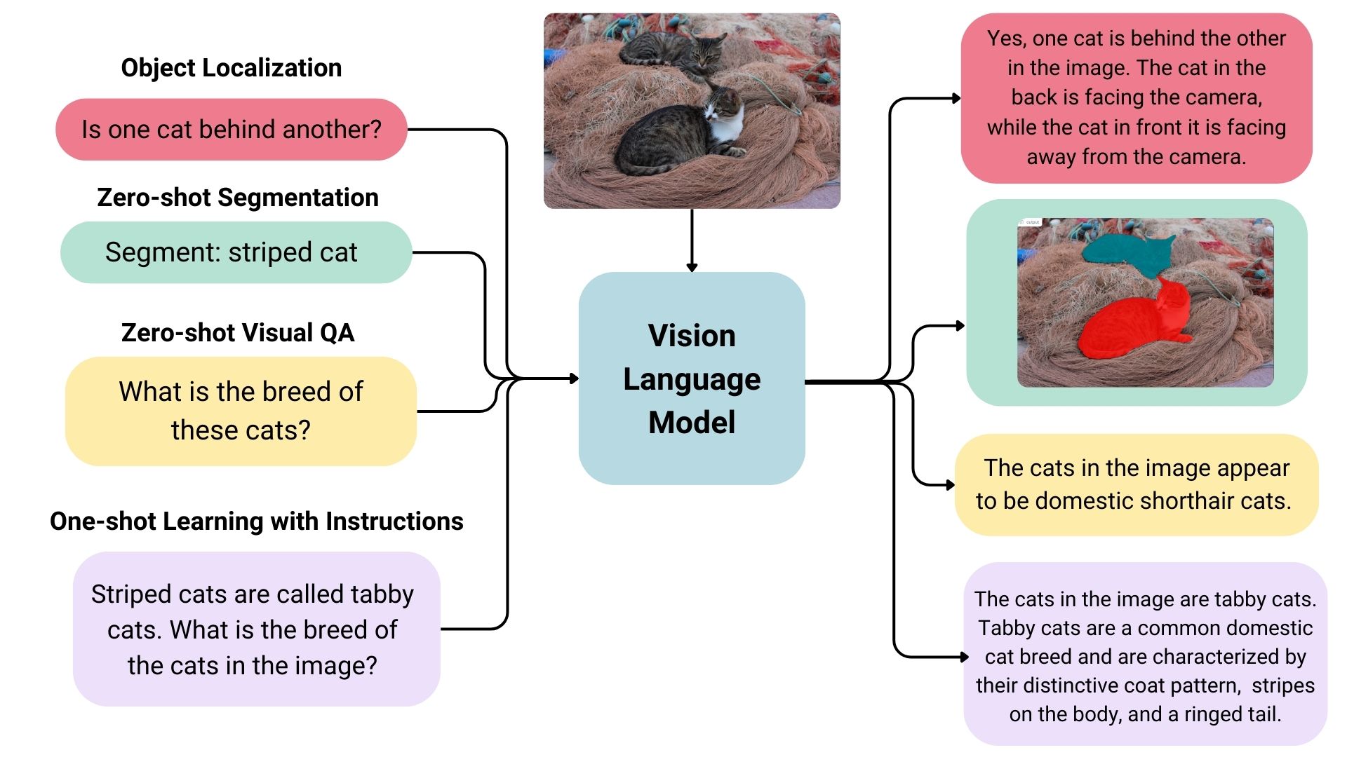
VLMs are a form of artificial intelligence that can understand and learn from visuals and linguistic modalities.

They are trained on vast amounts of data that include images, videos, and text, allowing them to learn patterns and relationships between these modalities. In simple terms, a VLM can look at an image or video and generate a corresponding text description that accurately matches the visual content.

VLMs typically consist of three main components:

  1. An image model that extracts meaningful visual information,
  2. A text model that processes and understands natural language,
  3. A fusion mechanism that combines the representations learned by the image and text models, enabling cross-modal interactions.

Generally speaking, the image model — also known as the vision encoder — extracts visual features from input images and maps them to the language model’s input space, creating visual tokens. The text model then processes and understands natural language by generating text embeddings. Lastly, these visual and textual representations are combined through the fusion mechanism, allowing the model to integrate visual and textual information.

VLMs bring a new level of intelligence to applications by bridging visual and linguistic understanding. Here are some of the applications where VLMs shine:

  • Image captions: VLMs can provide automatic descriptions that enrich user experiences, improve searchability, and even enhance visuals for vision impairments.
  • Visual answers to questions: VLMs could be integrated into educational tools to help students learn more deeply by allowing them to ask questions about visuals they encounter in learning materials, such as complex diagrams and illustrations.
  • Document analysis: VLMs can streamline document review processes, identifying critical information in contracts, reports, or patents much faster than reviewing them manually.
  • Image search: VLMs could open up the ability to perform reverse image searches. For example, an e-commerce site might allow users to upload image files that are processed to identify similar products that are available for purchase.
  • Content moderation: Social media platforms could benefit from VLMs by identifying and removing harmful or sensitive content automatically before publishing it.
  • Robotics: In industrial settings, robots equipped with VLMs can perform quality control tasks by understanding visual cues and describing defects accurately.

This is merely an overview of what VLMs are and the pieces that come together to generate audio descriptions. To get a clearer idea of how VLMs work, let’s look at a few real-world examples that leverage VLM processes.

VLM Examples

Based on the use cases we covered alone, you can probably imagine that VLMs come in many forms, each with its unique strengths and applications. In this section, we will look at a few examples of VLMs that can be used for a variety of different purposes.

IDEFICS

IDEFICS is an open-access model inspired by Deepmind’s , designed to understand and generate text from images and text inputs. It’s similar to OpenAI’s GPT-4 model in its multimodal capabilities but is built entirely from publicly available data and models.

IDEFICS is trained on public data and models — like LLama V1 and Open Clip — and comes in two versions: the base and instructed versions, each available in and parameter sizes.

The model combines two pre-trained unimodal models (for vision and language) with newly added Transformer blocks that allow it to bridge the gap between understanding images and text. It’s trained on a mix of image-text pairs and multimodal web documents, enabling it to handle a wide range of visual and linguistic tasks. As a result, IDEFICS can answer questions about images, provide detailed descriptions of visual content, generate stories based on a series of images, and function as a pure language model when no visual input is provided.

PaliGemma

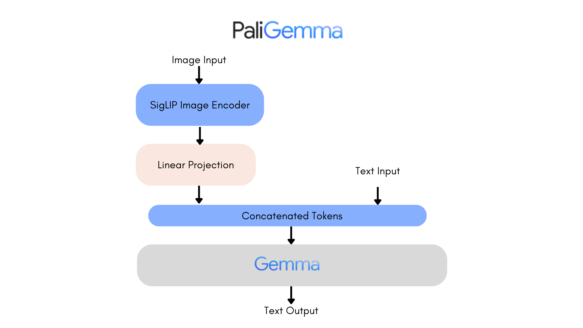
is an advanced VLM that draws inspiration from and leverages open-source components like the vision model and the language model.

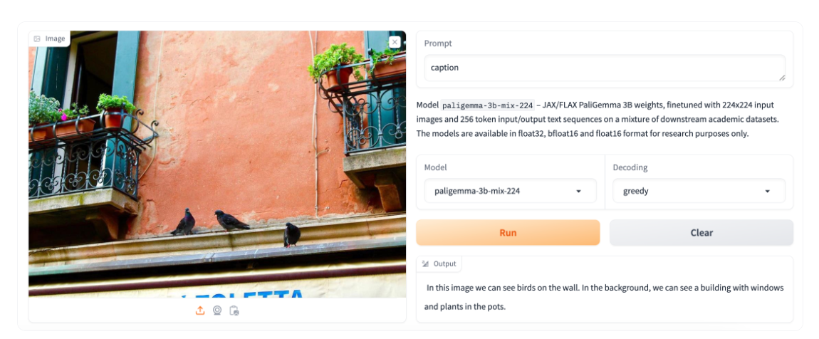
Designed to process both images and textual input, PaliGemma excels at generating descriptive text in multiple languages. Its capabilities extend to a variety of tasks, including image captioning, answering questions from visuals, reading text, detecting subjects in images, and segmenting objects displayed in images.

The core architecture of PaliGemma includes a Transformer decoder paired with a Vision Transformer image encoder that boasts an impressive 3 billion parameters. The text decoder is derived from , while the image encoder is based on .

Through training methods similar to PaLI-3, PaliGemma achieves exceptional performance across numerous vision-language challenges.

PaliGemma is offered in two distinct sets:

  • General Purpose Models (PaliGemma): These pre-trained models are designed for fine-tuning a wide array of tasks, making them ideal for practical applications.
  • Research-Oriented Models (PaliGemma-FT): Fine-tuned on specific research datasets, these models are tailored for deep research on a range of topics.

Phi-3-Vision-128K-Instruct

The model is a Microsoft-backed venture that combines text and vision capabilities. It’s built on a dataset of high-quality, reasoning-dense data from both text and visual sources. Part of the Phi-3 family, the model has a context length of 128K, making it suitable for a range of applications.

You might decide to use Phi-3-Vision-128K-Instruct in cases where your application has limited memory and computing power, thanks to its relatively lightweight that helps with latency. The model works best for generally understanding images, recognizing characters in text, and describing charts and tables.

Yi Vision Language (Yi-VL)

is an open-source AI model developed by that can have multi-round conversations with images by reading text from images and translating it. This model is part of the Yi LLM series and has two versions: and .

What distinguishes Yi-VL from other models is its ability to carry a conversation, whereas other models are typically limited to a single text input. Plus, it’s bilingual making it more versatile in a variety of language contexts.

Finding And Evaluating VLMs

There are many, many VLMs and we only looked at a few of the most notable offerings. As you commence work on an application with image-to-text capabilities, you may find yourself wondering where to look for VLM options and how to compare them.

There are two resources in the Hugging Face community you might consider using to help you find and compare VLMs. I use these regularly and find them incredibly useful in my work.

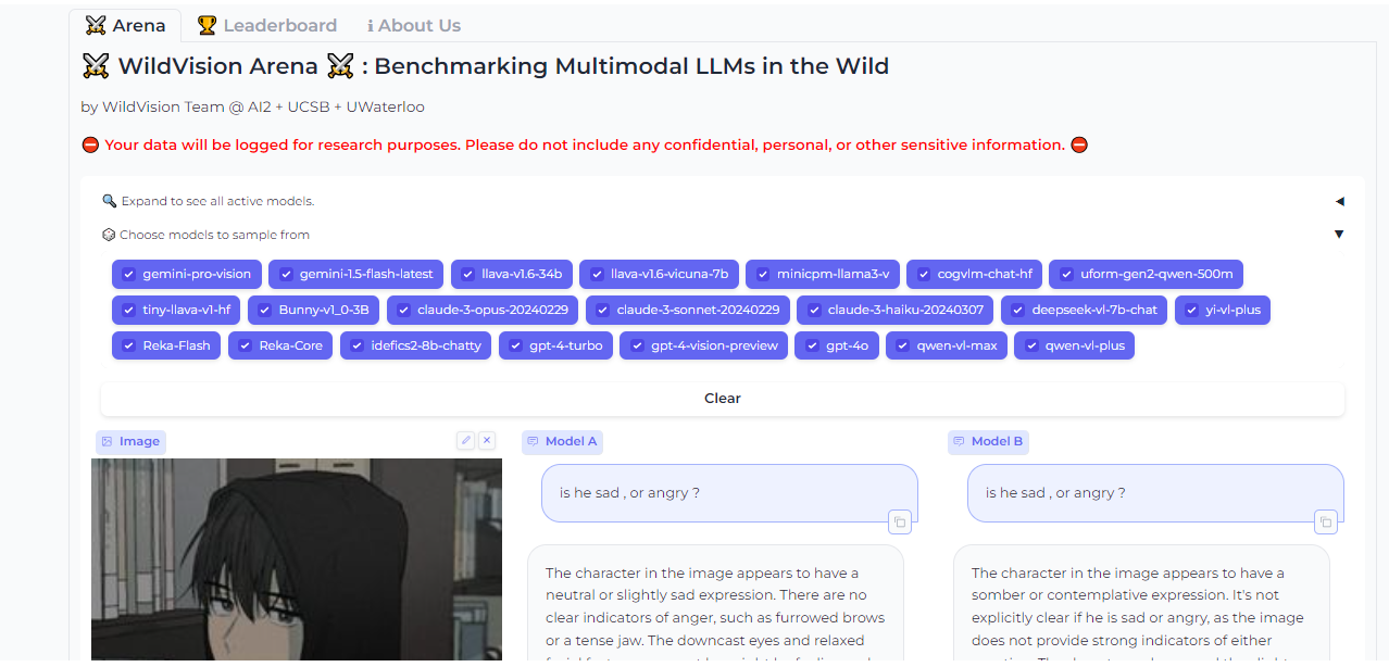
Vision Arena

is a leaderboard that ranks VLMs based on anonymous user voting and reviews. But what makes it great is the fact that you can compare any two models side-by-side for yourself to find the best fit for your application.

And when you compare two models, you can contribute your own anonymous votes and reviews for others to lean on as well.

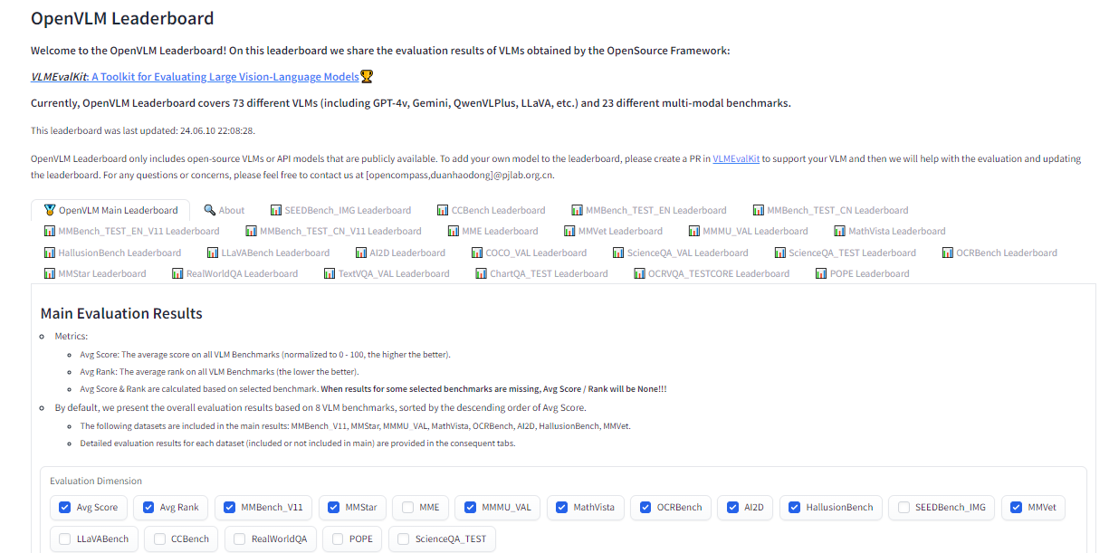
OpenVLM Leaderboard

is another leaderboard hosted on Hugging Face for getting technical specs on different models. What I like about this resource is the wealth of metrics for evaluating VLMs, including the speed and accuracy of a given VLM.

Further, OpenVLM lets you filter models by size, type of license, and other ranking criteria. I find it particularly useful for finding VLMs I might have overlooked or new ones I haven’t seen yet.

Text-To-Speech Technology

Earlier, I mentioned that the app we are about to build will use vision-language models to generate written descriptions of images, which are then read aloud. The technology that handles converting text to audio speech is known as text-to-speech synthesis or simply text-to-speech (TTS).

TTS converts written text into synthesized speech that sounds natural. The goal is to take published content, like a blog post, and read it out loud in a realistic-sounding human voice.

So, how does TTS work? First, it breaks down text into the smallest units of sound, called phonemes, and this process allows the system to figure out proper word pronunciations. Next, AI enters the mix, including deep learning algorithms trained on hours of human speech data. This is how we get the app to mimic human speech patterns, tones, and rhythms — all the things that make for “natural” speech. The AI component is key as it elevates a voice from robotic to something with personality. Finally, the system combines the phoneme information with the AI-powered digital voice to render the fully expressive speech output.

The result is automatically generated speech that sounds fairly smooth and natural. Modern TTS systems are extremely advanced in that they can replicate different tones and voice inflections, work across languages, and understand context. This naturalness makes TTS ideal for humanizing interactions with technology, like having your device read text messages out loud to you, just like Apple’s Siri or Microsoft’s Cortana.

TTS Examples

Based on the use cases we covered alone, you can probably imagine that VLMs come in many forms, each with its unique strengths and applications. In this section, we will look at a few examples of VLMs that can be used for a variety of different purposes.

Just as we took a moment to review existing vision language models, let’s pause to consider some of the more popular TTS resources that are available.

Bark

Straight from Bark’s model card in Hugging Face:

“Bark is a transformer-based text-to-audio model created by . Bark can generate highly realistic, multilingual speech as well as other audio — including music, background noise, and simple sound effects. The model can also produce nonverbal communication, like laughing, sighing, and crying. To support the research community, we are providing access to pre-trained model checkpoints ready for inference.”

The non-verbal communication cues are particularly interesting and a distinguishing feature of Bark. Check out the various things Bark can do to communicate emotion, pulled directly from the model’s :

  • [laughter]
  • [laughs]
  • [sighs]
  • [music]
  • [gasps]
  • [clears throat]

This could be cool or creepy, depending on how it’s used, but reflects the sophistication we’re working with. In addition to laughing and gasping, Bark is different in that it doesn’t work with phonemes like a typical TTS model:

“It is not a conventional TTS model but instead a fully generative text-to-audio model capable of deviating in unexpected ways from any given script. Different from previous approaches, the input text prompt is converted directly to audio without the intermediate use of phonemes. It can, therefore, generalize to arbitrary instructions beyond speech, such as music lyrics, sound effects, or other non-speech sounds.”

Coqui

can clone voices in different languages. All it needs for training is a short six-second clip of audio. This means the model can be used to translate audio snippets from one language into another while maintaining the same voice.

At the time of writing, Coqui currently supports 16 languages, including English, Spanish, French, German, Italian, Portuguese, Polish, Turkish, Russian, Dutch, Czech, Arabic, Chinese, Japanese, Hungarian, and Korean.

Parler-TTS

excels at generating high-quality, natural-sounding speech in the style of a given speaker. In other words, it replicates a person’s voice. This is where many folks might draw an ethical line because techniques like this can be used to essentially imitate a real person, even without their consent, in a process known as and the consequences can range from benign impersonations to .

But that’s not really the aim of Parler-TTS. Rather, it’s good in contexts that require personalized and natural-sounding speech generation, such as voice assistants and possibly even accessibility tooling to aid visual impairments by announcing content.

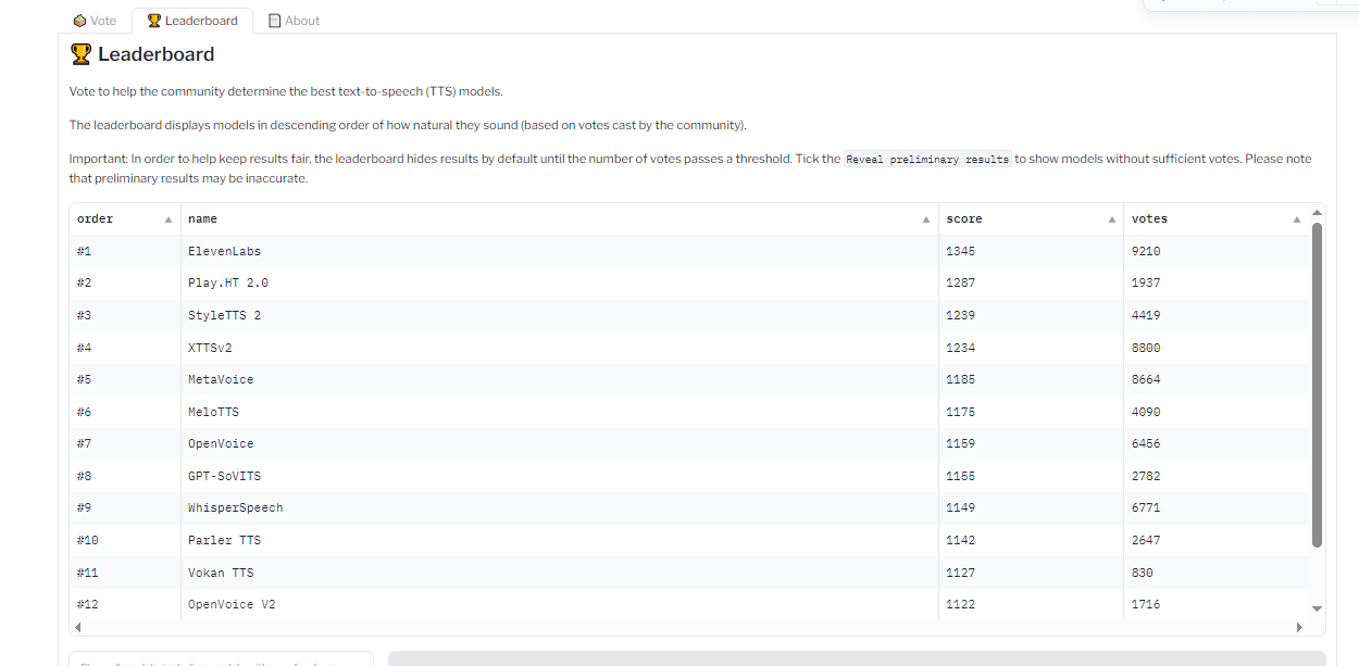
TTS Arena Leaderboard

Do you know how I shared the OpenVLM Leaderboard for finding and comparing vision language models? Well, there’s an equivalent leadership for TTS models as well over at the Hugging Face community called .

TTS models are ranked by the “naturalness” of their voices, with the most natural-sounding models ranked first. Developers like you and me vote and provide feedback that influences the rankings.

TTS API Providers

What we just looked at are TTS models that are baked into whatever app we’re making. However, some models are consumable via API, so it’s possible to get the benefits of a TTS model without the added bloat if a particular model is made available by an API provider.

Whether you decide to bundle TTS models in your app or integrate them via APIs is totally up to you. There is no right answer as far as saying one method is better than another — it’s more about the app’s requirements and whether the dependability of a baked-in model is worth the memory hit or vice-versa.

All that being said, I want to call out a handful of TTS API providers for you to keep in your back pocket.

ElevenLabs

that uses neural networks to make voices sound natural. Voices can be customized for different languages and accents, leading to realistic, engaging voices.

. You can enter a block of text and choose from a wide variety of voices that read the submitted text aloud.

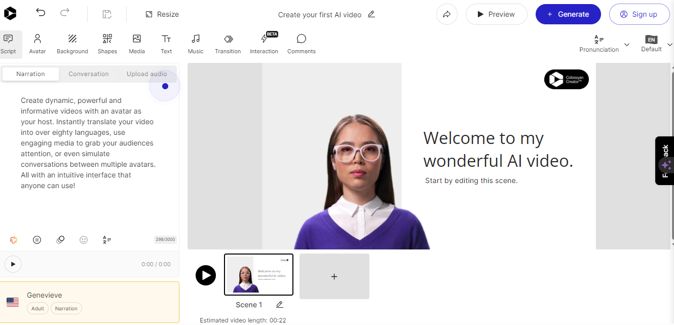
Colossyan

converts text into natural-sounding voice recordings in over 70 languages and accents. From there, the service allows you to match the audio to an avatar to produce something like a complete virtual presentation based on your voice — or someone else’s.

Once again, this is encroaching on deepfake territory, but it’s really interesting to think of Colossyan’s service as a virtual casting call for actors to perform off a script.

Murf.ai

is yet another TTS API designed to generate voiceovers based on real human voices. The service provides a slew of premade voices you can use to generate audio for anything from explainer videos and audiobooks to course lectures and entire podcast episodes.

Amazon Polly

Amazon has its own TTS API called . You can using lexicons and (SSML) tags for establishing speaking styles with affordances for adjusting things like pitch, speed, and volume.

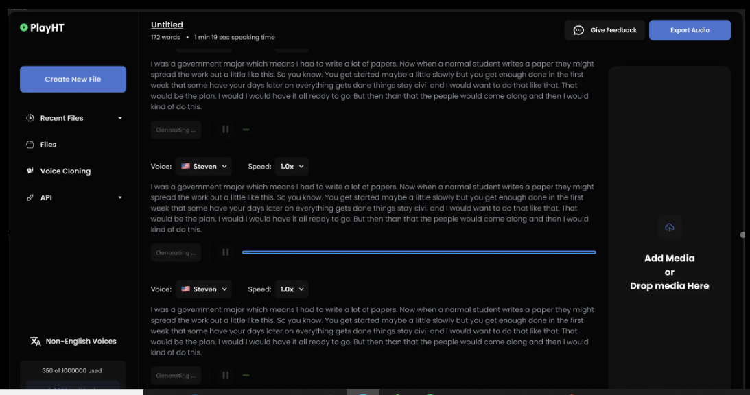
PlayHT

The generates speech in 142 languages. Type what you want it to say, pick a voice, and download the output as an MP3 or WAV file.

Demo: Building An Image-to-Audio Interface

So far, we have discussed the two primary components for generating audio from text: vision-language models and text-to-speech models. We’ve covered what they are, where they fit into the process of generating real-sounding speech, and various examples of each model.

Now, it’s time to apply those concepts to the app we are building in this tutorial (and will improve in a second tutorial). We will use a VLM so the app can glean meaning and context from images, a TTS model to generate speech that mimics a human voice, and then integrate our work into a user interface for submitting images that will lead to generated speech output.

I have decided to base our work on a VLM by Salesforce called , a TTS model from Kakao Enterprise called , and as a framework for the design interface. , but the gist is that it is a Python library for building web interfaces — only it offers built-in tools for working with machine learning models that make Gradio ideal for a tutorial like this.

You can use completely different models if you like. The whole point is less about the intricacies of a particular model than it is to demonstrate how the pieces generally come together.

Oh, and one more detail worth noting: I am working with the code for all of this in . I’m using it because it’s hosted and ideal for demonstrations like this. But you can certainly work in a more traditional IDE, like VS Code.

Installing Libraries

First, we need to install the necessary libraries:

#python
!pip install gradio pillow transformers scipy numpy

We can upgrade the transformers library to the latest version if we need to:

#python
!pip install --upgrade transformers

Not sure if you need to upgrade? Here’s how to check the current version:

#python
import transformers
print(transformers.__version__)

OK, now we are ready to import the libraries:

#python
import gradio as gr
from PIL import Image
from transformers import pipeline
import scipy.io.wavfile as wavfile
import numpy as np

These libraries will help us process images, use models on the Hugging Face hub, handle audio files, and build the UI.

Creating Pipelines

Since we will pull our models directly from Hugging Face’s , we can tap into them using . This way, we’re working with an API for tasks that involve natural language processing and computer vision without carrying the load in the app itself.

We set up our pipeline like this:

#python
caption_image = pipeline("image-to-text", model="Salesforce/blip-image-captioning-large")

This establishes a pipeline for us to access BLIP for converting images into textual descriptions. Again, you could establish a pipeline for any other model in the Hugging Face hub.

We’ll need a pipeline connected to our TTS model as well:

#python
Narrator = pipeline("text-to-speech", model="kakao-enterprise/vits-ljs")

Now, we have a pipeline where we can pass our image text to be converted into natural-sounding speech.

Converting Text to Speech

What we need now is a function that handles the audio conversion. Your code will differ depending on the TTS model in use, but here is how I approached the conversion based on the VITS model:

#python

def generate_audio(text):
  # Generate speech from the input text using the Narrator (VITS model)
  Narrated_Text = Narrator(text)

  # Extract the audio data and sampling rate
  audio_data = np.array(Narrated_Text["audio"][0])
  sampling_rate = Narrated_Text["sampling_rate"]

  # Save the generated speech as a WAV file
  wavfile.write("generated_audio.wav", rate=sampling_rate, data=audio_data)

  # Return the filename of the saved audio file
  return "generated_audio.wav"

That’s great, but we need to make sure there’s a bridge that connects the text that the app generates from an image to the speech conversion. We can write a function that uses BLIP to generate the text and then calls the generate_audio() function we just defined:

#python
def caption_my_image(pil_image):
  # Use BLIP to generate a text description of the input image
  semantics = caption_image(images=pil_image)[0]["generated_text"]

  # Generate audio from the text description
  return generate_audio(semantics)

Building The User Interface

Our app would be pretty useless if there was no way to interact with it. This is where Gradio comes in. We will use it to create a form that accepts an image file as an input and then outputs the generated text for display as well as the corresponding file containing the speech.

#python

main_tab = gr.Interface(
  fn=caption_my_image,
  inputs=[gr.Image(label="Select Image", type="pil")],
  outputs=[gr.Audio(label="Generated Audio")],
  title=" Image Audio Description App",
  description="This application provides audio descriptions for images."
)

# Information tab
info_tab = gr.Markdown("""
  # Image Audio Description App
  ### Purpose
  This application is designed to assist visually impaired users by providing audio descriptions of images. It can also be used in various scenarios such as creating audio captions for educational materials, enhancing accessibility for digital content, and more.

  ### Limits
  - The quality of the description depends on the image clarity and content.
  - The application might not work well with images that have complex scenes or unclear subjects.
  - Audio generation time may vary depending on the input image size and content.
  ### Note
  - Ensure the uploaded image is clear and well-defined for the best results.
  - This app is a prototype and may have limitations in real-world applications.
""")

# Combine both tabs into a single app 
 demo = gr.TabbedInterface(
  [main_tab, info_tab],
  tab_names=["Main", "Information"]
)

demo.launch()

The interface is quite plain and simple, but that’s OK since our work is purely for demonstration purposes. You can always add to this for your own needs. The important thing is that you now have a working application you can interact with.

At this point, you could run the app and try it in Google Collab. You also have the option to deploy your app, though you’ll need hosting for it. that you can use to deploy your work and run it without Google Collab. There’s even a you can use to set up your own Space.

Here’s the final app that you can try by uploading your own photo:

Coming Up…

We covered a lot of ground in this tutorial! In addition to learning about VLMs and TTS models at a high level, we looked at different examples of them and then covered how to find and compare models.

But the rubber really met the road when we started work on our app. Together, we made a useful tool that generates text from an image file and then sends that text to a TTS model to convert it into speech that is announced out loud and downloadable as either an MP3 or WAV file.

But we’re not done just yet! What if we could glean even more detailed information from images and our app not only describes the images but can also carry on a conversation about them?

Sounds exciting, right? This is exactly what we’ll do in the second part of this tutorial.

Getting To The Bottom Of Minimum WCAG-Conformant Interactive Element Size

There are many rumors and misconceptions about conforming to WCAG criteria for the minimum sizing of interactive elements. I’d like to use this post to demystify what is needed for baseline compliance and to point out an approach for making successful and inclusive interactive experiences using ample target sizes.

Minimum Conformant Pixel Size

Getting right to it: When it comes to pure Web Content Accessibility Guidelines (WCAG) conformance, the bare minimum for an interactive, non-inline element is 24×24 pixels. This is outlined in .

Success Criterion 2.5.8 is level AA, which is the most commonly used level for public, mass-consumed websites. This Success Criterion (or SC for short) is sometimes confused for , which is level AAA. The two are distinct and provide separate guidance for properly sizing interactive elements, even if they appear similar at first glance.

SC 2.5.8 is relatively new to WCAG, having been released as , which was published on October 5th, 2023. WCAG 2.2 is the most current version of the standard, but this newer release date means that knowledge of its existence isn’t as widespread as the older SC, especially outside of web accessibility circles. That said, WCAG 2.2 will remain the standard until WCAG 3.0 is released, something that is likely going to take 10–15 years or more to happen.

SC 2.5.5 calls for larger interactive elements sizes that are at least 44×44 pixels (compared to the SC 2.5.8 requirement of 24×24 pixels). At the same time, notice that SC 2.5.5 is (compared to SC 2.5.8, level AA) which is a level reserved for specialized support beyond level AA.

Sites that need to be fully are rare. Chances are that if you are making a website or web app, you’ll only need to support level AA. Level AAA is often reserved for large or highly specialized institutions.

Making Interactive Elements Larger With CSS Padding

The family of in CSS can be used to extend the interactive area of an element to make it conformant. For example, declaring padding: 4px; on an element that measures 16×16 pixels invisibly increases its bounding box to a total of 24×24 pixels. This, in turn, means the interactive element satisfies SC 2.5.8.

This is a good trick for making smaller interactive elements easier to click and tap. If you want more information about this sort of thing, I enthusiastically recommend ’s post, “”.

I think it’s also worth noting that CSS margin could also hypothetically be used to achieve level AA conformance since the SC includes a spacing exception:

The size of the for is at least 24×24 , except where:

Spacing: Undersized targets (those less than 24×24 CSS pixels) are positioned so that if a 24 CSS pixel diameter circle is centered on the of each, the circles do not intersect another target or the circle for another undersized target;

[…]

The difference here is that padding extends the interactive area, while margin does not. Through this lens, you’ll want to honor the spirit of the success criterion because . At the end of the day, we want to help people successfully click or tap interactive elements, such as buttons.

What About Inline Interactive Elements?

We tend to think of targets in terms of block elements — elements that are displayed on their own line, such as a button at the end of a call-to-action. However, interactive elements can be inline elements as well. Think of links in a paragraph of text.

Inline interactive elements, such as text links in paragraphs, do not need to meet the 24×24 pixel minimum requirement. Just as margin is an exception in , so are inline elements with an interactive target:

The size of the for is at least 24×24 , except where:

[…]

Inline: The target is in a sentence or its size is otherwise constrained×the line-height of non-target text;

[…]

Apple And Android: The Source Of More Confusion

If the differences between interactive elements that are inline and block are still confusing, that’s probably because the whole situation is even further muddied by third-party human interface guidelines requiring interactive sizes closer to what the level AAA Success Criterion 2.5.5 Target Size (Enhanced) demands.

For example, Apple’s “” and Google’s “” are guidelines for how to design interfaces for their respective platforms. Apple’s guidelines recommend that , whereas Google’s guides stipulate target sizes that are .

These may satisfy Apple and Google requirements for designing interfaces, but are they WCAG-conformant Apple and Google — not to mention any other organization with UI guidelines — can specify whatever interface requirements they want, but are they copasetic with WCAG SC 2.5.5 and SC 2.5.8?

It’s important to ask this question because there is a hierarchy when it comes to accessibility compliance, and it contains legal levels:

Human interface guidelines often inform design systems, which, in turn, influence the sites and apps that are built by authors like us. But they’re not the “authority” on accessibility compliance. Notice how everything is (and ought to be) influenced by WCAG at the very top of the chain.

Even if these third-party interface guidelines conform to SC 2.5.5 and 2.5.8, it’s still tough to tell when they are expressed in “” and “” which aren’t pixels, but often get conflated as such. I’d advise not getting too deep into researching -pixel%3F). Trust me when I say it’s a road you don’t want to go down. But whatever the case, the inconsistent use of unit sizes exacerbates the issue.

Can’t We Just Use A Media Query?

I’ve also observed some developers attempting to use as a clever “trick” to , then conditionally adjust an interactive element’s size as a way to get around the WCAG requirement.

After all, mouse cursors are for fine movements, and touchscreens are for more broad gestures, right? Not always. The thing is, devices are multimodal. They can support and don’t require a special switch to flip or button to press to do so. A straightforward example of this is switching between a trackpad and a keyboard while you browse the web. A less considered example is a device with a touchscreen that also supports a trackpad, keyboard, mouse, and voice input.

You might think that the combination of trackpad, keyboard, mouse, and voice inputs sounds like some sort of absurd, obscure Frankencomputer, but what I just described is a , and guess what? They’re .

Responsive Design Vs. Inclusive Design

There is a difference between the two, even though they are often used interchangeably. Let’s delineate the two as clearly as possible:

  • Responsive Design is about designing for an unknown device.
  • Inclusive Design is about designing for an unknown user.

The other end of this consideration is that people with — like hand tremors or arthritis — can and do use mice inputs. This means that fine input actions may be painful and difficult, yet ultimately still possible to perform.

People also use more precise input mechanisms for touchscreens all the time, including both and . In other words, some devices designed to accommodate coarse input can also be used for .

I’d be remiss if I didn’t also point out that people plug mice and keyboards into smartphones. We cannot automatically say that they only support coarse pointers:

Context Is King

Conformant and successful interactive areas — both large and small — require knowing the ultimate goals of your website or web app. When you arm yourself with this context, you are empowered to make informed decisions about the kinds of people who use your service, why they use the service, and how you can accommodate them.

For example, the because it knows the user is likely holding an adorable, albeit squirmy and fussy, baby while using the application. This allows Glow Baby to emphasize the interactive targets in the interface to accommodate parents who have their hands full.

In the same vein, — such as those used in map apps — :

For example, in digital maps, the position of pins is analogous to the position of places shown on the map. If there are many pins close together, the spacing between pins and neighboring pins will often be below 24 CSS pixels. It is essential to show the pins at the correct map location; therefore, the Essential exception applies.

[…]

When the “Essential” exception is applicable, authors are strongly encouraged to provide equivalent functionality through alternative means to the extent practical.

Note that this exemption language is not carte blanche to make your own work an exception to the rule. It is more of a mechanism, and an acknowledgment that broadly applied rules may have exceptions that are worth thinking through and documenting for future reference.

Further Considerations

We also want to consider the larger context of the device itself as well as the environment the device will be used in.

. Smaller devices that are moved around in space a lot (e.g., smartwatches) may benefit from alternate input mechanisms such as voice commands.

What about people who are driving in a car? People in this context probably ought to be provided straightforward, simple interactions that are facilitated via large interactive areas to prevent them from taking their eyes off the road. The same could also be said for high-stress environments like hospitals and .

Similarly, may require interactive areas that are larger than WCAG requirements for interactive areas. So would experiences aimed at older demographics, where age-derived vision and motor control disability factors tend to be more present.

Minimum conformant interactive area experiences may also make sense in their own contexts. Data-rich, information-dense experiences like come to mind here.

Design Systems Are Also Worth Noting

While you can control what components you include in a , you cannot control where and how they’ll be used by those who adopt and use that design system. Because of this, I suggest defensively baking accessible defaults into your design systems because they can go a long way toward incorporating accessible practices when they’re integrated right out of the box.

One option worth consideration is providing an accessible range of choices. Components, like buttons, can have size variants (e.g., small, medium, and large), and you can provide a minimally conformant interactive target on the smallest variant and then offer larger, equally conformant versions.

So, How Do We Know When We’re Good?

There is no magic number or formula to get you that perfect Goldilocks “not too small, not too large, but just right” interactive area size. It requires knowledge of what the people who want to use your service want, and how they go about getting it.

The best way to learn that? Ask people.

Accessibility research includes more than just asking people who use screen readers what they think. It’s also a lot easier to conduct than you might think! For example, prototypes are a great way to quickly and inexpensively evaluate and de-risk your ideas before committing to writing production code. “” by is chock full of tips, strategies, and resources you can use to help you get started with accessibility research.

Wrapping Up

The bottom line is that

“Compliant” does not always equate to “usable.” But compliance does help set baseline requirements that benefit everyone.

To sum things up:

  • 24×24 pixels is the bare minimum in terms of WCAG conformance.
  • Inline interactive elements, such as links placed in paragraphs, are exempt.
  • 44×44 pixels is for WCAG level AAA support, and level AAA is reserved for specialized experiences.
  • Human interface guidelines by the likes of Apple, Android, and other companies must ultimately confirm to WCAG.
  • Devices are multimodal and can use different kinds of input concurrently.
  • Baking sensible accessible defaults into design systems can go a long way to ensuring widespread compliance.
  • Larger interactive element sizes may be helpful in many situations, but might not be recognized as an interactive element if they are too large.
  • User research can help you learn about your audience.

And, perhaps most importantly, all of this is about people and enabling them to get what they need.

Further Reading

  • (TetraLogical)
  • (Web Accessibility Initiative)
  • (CSS-Tricks)
  • (TetraLogical)

Build Design Systems With Penpot Components

This article is a sponsored by

If you’ve been following along with our Penpot series, you’re already familiar with this exciting open-source design tool and how it is changing the game for designer-developer collaboration. Previously, we’ve explored Penpot’s and features, which bring the power of CSS directly into the hands of designers.

Today, we’re diving into another crucial aspect of modern web design and development: components. This feature is a part of Penpot’s major 2.0 release, which introduces a host of new capabilities to bridge the gap between design and code further. Let’s explore how Penpot’s implementation of components can supercharge your design workflow and foster even better collaboration across teams.

About Components

Components are reusable building blocks that form the foundation of modern user interfaces. They encapsulate a piece of UI or functionality that can be reused across your application. This concept of composability — building complex systems from smaller, reusable parts — is a cornerstone of modern web development.

Why does composability matter? There are several key benefits:

  • Single source of truth
    Changes to a component are reflected everywhere it’s used, ensuring consistency.
  • Flexibility with simpler dependencies
    Components can be easily swapped or updated without affecting the entire system.
  • Easier maintenance and scalability
    As your system grows, components help manage complexity.

In the realm of design, this philosophy is best expressed in the concept of design systems. When done right, design systems help to bring your design and code together, reducing ambiguity and streamlining the processes.

However, that’s not so easy to achieve when your designs are built using logic and standards that are much different from the code they’re related to. Penpot works to solve this challenge through its unique approach. Instead of building visual artifacts that only mimic real-world interfaces, UIs in Penpots are built using the same technologies and standards as real working products.

This gives us much better parity between the media and allows designers to build interfaces that are already expressed as code. It fosters easier collaboration as designers and developers can speak the same language when discussing their components. The final result is more maintainable, too. Changes created by designers can propagate consistently, making it easier to manage large-scale systems.

Now, let’s take a look at how components in Penpot work in practice! As an example, I’m going to use the following fictional product page and recreate it in Penpot:

Components In Penpot

Creating Components

To create a component in Penpot, simply select the objects you want to include and select “Create component” from the context menu. This transforms your selection into a reusable element.

Creating Component Variants

Penpot allows you to create variants of your components. These are alternative versions that share the same basic structure but differ in specific aspects like color, size, or state.

You can create variants by using slashes (/) in the components name, for example, by naming your buttons Button/primary and Button/secondary. This will allow you to easily switch between types of a Button component later.

Nesting Components And Using External Libraries

Components in Penpot can be nested, allowing you to build complex UI elements from simpler parts. This mirrors how developers often structure their code. In other words, you can place components inside one another.

Moreover, the components you use don’t have to come from the same file or even from the same organization. You can easily share libraries of components across projects just as you would import code from various dependencies into your codebase. You can also import components from external libraries, such as UI kits and icon sets. Penpot maintains for you to choose from, including everything from the large design systems like Material Design to the most popular icon libraries.

Organizing Your Design System

The new major release of Penpot comes with a redesigned Assets panel, which is where your components live. In the Assets panel, you can easily access your components and drag and drop them into designs.

For the better maintenance of design systems, Penpot allows you to store your colors and typography as reusable styles. Same as components, you can name your styles and organize them into hierarchical structures.

Configuring Components

One of the main benefits of using composable components in front-end libraries such as React is their support of props. Component props (short for properties) allow you a great deal of flexibility in how you configure and customize your components, depending on how, where, and when they are used.

Penpot offers similar capabilities in a design tool with variants and overrides. You can switch variants, hide elements, change styles, swap nested components within instances, or even change the whole layout of a component, providing flexibility while maintaining the link to the original component.

Creating Flexible, Scalable Systems

Allowing you to modify Flex and Grid layouts in component instances is where Penpot really shines. However, the power of these layout features goes beyond the components themselves.

With Flex Layout and Grid Layout, you can build components that are much more faithful to their code and easier to modify and maintain. But having those powerful features at your fingertips means that you can also place your components in other Grid and Flex layouts. That’s a big deal as it allows you to test your components in scenarios much closer to their real environment. Directly in a design tool, you can see how your component would behave if you put it in various places on your website or app. This allows you to fine-tune how your components fit into a larger system. It can dramatically reduce friction between design and code and streamline the handoff process.

Generating Components Code

As Penpot’s components are just web-ready code, one of the greatest benefits of using it is how easily you can export code for your components. This feature, like all of Penpot’s capabilities, is completely free.

Using Penpot’s Inspect panel, you can quickly grab all the layout properties and styles as well as the full code snippets for all components.

Documentation And Annotations

To make design systems in Penpot even more maintainable, it includes annotation features to help you document your components. This is crucial for maintaining a clear design system and ensuring a smooth handoff to developers.

Summary

Penpot’s implementation of components and its support for real CSS layouts make it a standout tool for designers who want to work closely with developers. By embracing web standards and providing powerful, flexible components, Penpot enables designers to create more developer-friendly designs without sacrificing creativity or control.

All of Penpot’s features are completely free for both designers and developers. As open-source software, Penpot lets you fully own your design tool experience and makes it accessible for everyone, regardless of team size and budget.

Ready to dive in? You can explore by downloading it and importing into your Penpot account.

As the design tool landscape continues to evolve, Penpot is taking charge of bringing designers and developers closer together. Whether you’re a designer looking to understand the development process or a developer seeking to streamline your workflow with designers, Penpot’s component system is worth exploring.

How To Design Effective Conversational AI Experiences: A Comprehensive Guide

Conversational AI is revolutionizing information access, offering a personalized, intuitive search experience that delights users and empowers businesses. A well-designed conversational agent acts as a knowledgeable guide, understanding user intent and effortlessly navigating vast data, which leads to happier, more engaged users, fostering loyalty and trust. Meanwhile, businesses benefit from increased efficiency, reduced costs, and a stronger bottom line. On the other hand, a poorly designed system can lead to frustration, confusion, and, ultimately, abandonment.

Achieving success with conversational AI requires more than just deploying a chatbot. To truly harness this technology, we must master the intricate dynamics of human-AI interaction. This involves understanding how users articulate needs, explore results, and refine queries, paving the way for a seamless and effective search experience.

This article will decode the three phases of conversational search, the challenges users face at each stage, and the strategies and best practices AI agents can employ to enhance the experience.

The Three Phases Of Conversational Search

To analyze these complex interactions, (PDF) proposed a framework that outlines three core phases in the conversational search process:

  1. Query formulation: Users express their information needs, often facing challenges in articulating them clearly.
  2. Search results exploration: Users navigate through presented results, seeking further information and refining their understanding.
  3. Query re-formulation: Users refine their search based on new insights, adapting their queries and exploring different avenues.

Building on this framework, (PDF) identified five key user actions within these phases: reveal, inquire, navigate, interrupt, interrogate, and the corresponding agent actions — inquire, reveal, traverse, suggest, and explain.

In the following sections, I’ll break down each phase of the conversational search journey, delving into the actions users take and the corresponding strategies AI agents can employ, as identified by (PDF). I’ll also share actionable tactics and real-world examples to guide the implementation of these strategies.

Phase 1: Query Formulation: The Art Of Articulation

In the initial phase of query formulation, users attempt to translate their needs into prompts. This process involves conscious disclosures — sharing details they believe are relevant — and unconscious non-disclosure — omitting information they may not deem important or struggle to articulate.

This process is fraught with challenges. As aptly pointed out,

“Articulating ideas in written prose is hard. Most likely, half the population can’t do it. This is a usability problem for current prompt-based AI user interfaces.”

— Jakob Nielsen

This can manifest as:

  • Vague language: “I need help with my finances.”
    Budgeting? Investing? Debt management?
  • Missing details: “I need a new pair of shoes.”
    What type of shoes? For what purpose?
  • Limited vocabulary: Not knowing the right technical terms. “I think I have a sprain in my ankle.”
    The user might not know the difference between a sprain and a strain or the correct anatomical terms.

These challenges can lead to frustration for users and less relevant results from the AI agent.

AI Agent Strategies: Nudging Users Towards Better Input

To bridge the articulation gap, AI agents can employ three core strategies:

  1. Elicit: Proactively guide users to provide more information.
  2. Clarify: Seek to resolve ambiguities in the user’s query.
  3. Suggest: Offer alternative phrasing or search terms that better capture the user’s intent.

The key to effective query formulation is balancing elicitation and assumption. Overly aggressive questioning can frustrate users, and making too many assumptions can lead to inaccurate results.

For example,

User: “I need a new phone.”

AI: “What’s your budget? What features are important to you? What size screen do you prefer? What carrier do you use?…”

This rapid-fire questioning can overwhelm the user and make them feel like they’re being interrogated. A more effective approach is to start with a few open-ended questions and gradually elicit more details based on the user’s responses.

As (PDF) stated in the paper,

“There may be a trade-off between the efficiency of the conversation and the accuracy of the information needed as the agent has to decide between how important it is to clarify and how risky it is to infer or impute the underspecified or missing details.”

Implementation Tactics And Examples

  • Probing questions: Ask open-ended or clarifying questions to gather more details about the user’s needs. For example, Perplexity Pro uses probing questions to elicit more details about the user’s needs for gift recommendations.

For example, after clicking one of the initial prompts, “Create a personal webpage,” ChatGPT added another sentence, “Ask me 3 questions first on whatever you need to know,” to elicit more details from the user.

  • Interactive refinement: Utilize visual aids like sliders, checkboxes, or image carousels to help users specify their preferences without articulating everything in words. For example, Adobe Firefly’s side settings allow users to adjust their preferences.

  • Suggested prompts: Provide examples of more specific or detailed queries to help users refine their search terms. For example, Nelson Norman Group provides an interface that offers a suggested prompt to help users refine their initial query.

For example, after clicking one of the initial prompts in Gemini, “Generate a stunning, playful image,” more details are added in blue in the input.

  • Offering multiple interpretations: If the query is ambiguous, present several possible interpretations and let the user choose the most accurate one. For example, Gemini offers a list of gift suggestions for the query “gifts for my friend who loves music,” categorized by the recipient’s potential music interests to help the user pick the most relevant one.

Phase 2: Search Results Exploration: A Multifaceted Journey

Once the query is formed, the focus shifts to exploration. Users embark on a multifaceted journey through search results, seeking to understand their options and make informed decisions.

Two primary user actions mark this phase:

  1. Inquire: Users actively seek more information, asking for details, comparisons, summaries, or related options.
  2. Navigate: Users navigate the presented information, browse through lists, revisit previous options, or request additional results. This involves scrolling, clicking, and using voice commands like “next” or “previous.”

AI Agent Strategies: Facilitating Exploration And Discovery

To guide users through the vast landscape of information, AI agents can employ these strategies:

  1. Reveal: Present information that caters to diverse user needs and preferences.
  2. Traverse: Guide the user through the information landscape, providing intuitive navigation and responding to their evolving interests.

During discovery, it’s vital to avoid information overload, which can overwhelm users and hinder their decision-making. For example,

User: “I’m looking for a place to stay in Tokyo.”

AI: Provides a lengthy list of hotels without any organization or filtering options.

Instead, AI agents should offer the most relevant results and allow users to filter or sort them based on their needs. This might include presenting a few top recommendations based on ratings or popularity, with options to refine the search by price range, location, amenities, and so on.

Additionally, AI agents should understand natural language navigation. For example, if a user asks, “Tell me more about the second hotel,” the AI should provide additional details about that specific option without requiring the user to rephrase their query. This level of understanding is crucial for flexible navigation and a seamless user experience.

Implementation Tactics And Examples

  • Diverse formats: Offer results in various formats (lists, summaries, comparisons, images, videos) and allow users to specify their preferences. For example, Gemini presents a summarized format of hotel information, including a photo, price, rating, star rating, category, and brief description to allow the user to evaluate options quickly for the prompt “I’m looking for a place to stay in Paris.”

  • Context-aware navigation: Maintain conversational context, remember user preferences, and provide relevant navigation options. For example, following the previous example prompt, Gemini reminds users of the potential next steps at the end of the response.

  • Interactive exploration: Use carousels, clickable images, filter options, and other interactive elements to enhance the exploration experience. For example, Perplexity offers a carousel of images related to “a vegetarian diet” and other interactive elements like “Watch Videos” and “Generate Image” buttons to enhance exploration and discovery.

  • Multiple responses: Present several variations of a response. For example, users can see multiple draft responses to the same query by clicking the “Show drafts” button in Gemini.

  • Flexible text length and tone. Enable users to customize the length and tone of AI-generated responses to better suit their preferences. For example, Gemini provides multiple options for welcome messages, offering varying lengths, tones, and degrees of formality.

Phase 3: Query Re-formulation: Adapting To Evolving Needs

As users interact with results, their understanding deepens, and their initial query might not fully capture their evolving needs. During query re-formulation, users refine their search based on exploration and new insights, often involving interrupting and interrogating. Query re-formulation empowers users to course-correct and refine their search.

  • Interrupt: Users might pause the conversation to:
    • Correct: “Actually, I meant a desktop computer, not a laptop.”
    • Add information: “I also need it to be good for video editing.”
    • Change direction: “I’m not interested in those options. Show me something else.”
  • Interrogate: Users challenge the AI to ensure it understands their needs and justify its recommendations:
    • Seek understanding: “What do you mean by ‘good battery life’?”
    • Request explanations: “Why are you recommending this particular model?”

AI Agent Strategies: Adapting And Explaining

To navigate the query re-formulation phase effectively, AI agents need to be responsive, transparent, and proactive. Two core strategies for AI agents:

  1. Suggest: Proactively offer alternative directions or options to guide the user towards a more satisfying outcome.
  2. Explain: Provide clear and concise explanations for recommendations and actions to foster transparency and build trust.

AI agents should balance suggestions with relevance and explain why certain options are suggested while avoiding overwhelming them with unrelated suggestions that increase conversational effort. A bad example would be the following:

User: “I want to visit Italian restaurants in New York.”

AI: Suggest unrelated options, like Mexican restaurants or American restaurants, when the user is interested in Italian cuisine.

This could frustrate the user and reduce trust in the AI.

A better answer could be, “I found these highly-rated Italian restaurants. Would you like to see more options based on different price ranges?” This ensures users understand the reasons behind recommendations, enhancing their satisfaction and trust in the AI’s guidance.

Implementation Tactics And Examples

  • Transparent system process: Show the steps involved in generating a response. For example, Perplexity Pro outlines the search process step by step to fulfill the user’s request.

  • Explainable recommendations: Clearly state the reasons behind specific recommendations, referencing user preferences, historical data, or external knowledge. For example, ChatGPT includes recommended reasons for each listed book in response to the question “books for UX designers.”

  • Source reference: Enhance the answer with source references to strengthen the evidence supporting the conclusion. For example, Perplexity presents source references to support the answer.

  • : Users should be able to directly select specific elements or locations within the dialogue for further interaction rather than having to describe them verbally. For example, users can select part of an answer and ask a follow-up in Perplexity.

  • Proactive recommendations: Suggest related or complementary items based on the user’s current selections. For example, Perplexity offers a list of related questions to guide the user’s exploration of “a vegetarian diet.”

Overcoming LLM Shortcomings

While the strategies discussed above can significantly improve the conversational search experience, LLMs still have inherent limitations that can hinder their intuitiveness. These include the following:

  • Hallucinations: Generating false or nonsensical information.
  • Lack of common sense: Difficulty understanding queries that require world knowledge or reasoning.
  • Sensitivity to input phrasing: Producing different responses to slightly rephrased queries.
  • Verbosity: Providing overly lengthy or irrelevant information.
  • Bias: Reflecting biases present in the training data.

To create truly effective and user-centric conversational AI, it’s crucial to address these limitations and make interactions more intuitive. Here are some key strategies:

  • Incorporate structured knowledge
    Integrating external knowledge bases or databases can ground the LLM’s responses in facts, reducing hallucinations and improving accuracy.
  • Fine-tuning
    Training the LLM on domain-specific data enhances its understanding of particular topics and helps mitigate bias.
  • Intuitive feedback mechanisms
    Allow users to easily highlight and correct inaccuracies or provide feedback directly within the conversation. This could involve clickable elements to flag problematic responses or a “this is incorrect” button that prompts the AI to reconsider its output.
  • Natural language error correction
    Develop AI agents capable of understanding and responding to natural language corrections. For example, if a user says, “No, I meant X,” the AI should be able to interpret this as a correction and adjust its response accordingly.
  • Adaptive learning
    Implement machine learning algorithms that allow the AI to learn from user interactions and improve its performance over time. This could involve recognizing patterns in user corrections, identifying common misunderstandings, and adjusting behavior to minimize future errors.

Training AI Agents For Enhanced User Satisfaction

Understanding and evaluating user satisfaction is fundamental to building effective conversational AI agents. However, directly measuring user satisfaction in the open-domain search context can be challenging, as highlighted. Traditionally, metrics like session abandonment rates or task completion were used as proxies, but these don’t fully capture the nuances of user experience.

To address this, offer a comprehensive approach to gathering and leveraging user feedback:

  • Identify key dialogue aspects
    To truly understand user satisfaction, we need to look beyond simple metrics like “thumbs up” or “thumbs down.” Consider evaluating aspects like relevance, interestingness, understanding, task completion, interest arousal, and efficiency. This multi-faceted approach provides a more nuanced picture of the user’s experience.
  • Collect multi-level feedback
    Gather feedback at both the turn level (each question-answer pair) and the dialogue level (the overall conversation). This granular approach pinpoints specific areas for improvement, both in individual responses and the overall flow of the conversation.
  • Recognize individual differences
    Understand that the concept of satisfaction varies per user. Avoid assuming all users perceive satisfaction similarly.
  • Prioritize relevance
    While all aspects are important, relevance (at the turn level) and understanding (at both the turn and session level) have been identified as key drivers of user satisfaction. Focus on improving the AI agent’s ability to provide relevant and accurate responses that demonstrate a clear understanding of the user’s intent.

Additionally, consider these practical tips for incorporating user satisfaction feedback into the AI agent’s training process:

  • Iterate on prompts
    Use user feedback to refine the prompts to elicit information and guide the conversation.
  • Refine response generation
    Leverage feedback to improve the relevance and quality of the AI agent’s responses.
  • Personalize the experience
    Tailor the conversation to individual users based on their preferences and feedback.
  • Continuously monitor and improve
    Regularly collect and analyze user feedback to identify areas for improvement and iterate on the AI agent’s design and functionality.

The Future Of Conversational Search: Beyond The Horizon

The evolution of conversational search is far from over. As AI technologies continue to advance, we can anticipate exciting developments:

  • Multi-modal interactions
    Conversational search will move beyond text, incorporating voice, images, and video to create more immersive and intuitive experiences.
  • Personalized recommendations
    AI agents will become more adept at tailoring search results to individual users, considering their past interactions, preferences, and context. This could involve suggesting restaurants based on dietary restrictions or recommending movies based on previously watched titles.
  • Proactive assistance
    Conversational search systems will anticipate user needs and proactively offer information or suggestions. For instance, an AI travel agent might suggest packing tips or local customs based on a user’s upcoming trip.

When Friction Is A Good Thing: Designing Sustainable E-Commerce Experiences

As lavish influencer lifestyles, wealth flaunting, and hauls dominate social media feeds, we shouldn’t be surprised that excessive consumption has become the default way of living. We see closets filled to the brim with cheap, throw-away items and having the latest gadget arsenal as signifiers of an aspirational life.

Consumerism, however, is more than a cultural trend; it’s the backbone of our economic system. Companies eagerly drive excessive consumption as an increase in sales is directly connected to an increase in profit.

While we learned to accept this level of material consumption as normal, we need to be reminded of the massive environmental impact that comes along with it. As Yvon Chouinard, founder of Patagonia, writes in a :

“Obsession with the latest tech gadgets drives open pit mining for . Demand for rubber continues to . Turning these and other raw materials into final products releases of all carbon emissions.”

— Yvon Chouinard

In the paper, , a group of researchers concluded that reducing material consumption today is essential to avoid the worst of the looming climate change in the coming years. This need for lowering consumption is also reflected in the UN’s Sustainability goals, specifically Goal 17, .

For a long time, design has been a tool for by for example, designing products with artificially limited useful life () to ensure continuous consumption. And if we want to understand specifically UX design’s role in influencing how much and what people buy, we have to take a deeper look at pushy online shopping experiences.

Design Shaping Shopping Habits: The Problem With Current E-commerce Design

Today, most online shopping experiences are designed with , , nudging and even to get unsuspecting users to add more things to their basket.

There are “Hurry, only one item left in stock” type messages and countdown clocks that exploit well-known cognitive biases to nudge users to make impulse purchase decisions. As ,

“The scarcity bias says that humans place a higher value on items they believe to be rare and a lower value on things that seem abundant. Scarcity marketing harnesses this bias to make brands more desirable and increase product sales. Online stores use limited releases, flash sales, and countdown timers to induce FOMO — the fear of missing out — among shoppers.”

— Michael Keenan

To make buying things quick and effortless, we remove friction from the checkout process, for example, with the one-click-buy button. As practitioners of user-centered design, we might implement the button and say: thanks to this frictionless and easy checkout process, we . Or did we just do a huge disservice to our users?

Gliding through the checkout process in seconds leaves no time for the user to ask, “Do I actually want this?” or “Do I have the money for this?”. Indeed, putting users on autopilot to make thoughtless decisions is the goal.

As a says: “Click to buy helps customers complete shopping within seconds and reduces the amount of time they have to reconsider their purchase.”

Amanda Mull about how it has become “too easy to buy stuff you don’t want”:

“The order took maybe 15 seconds. I selected my size and put the shoes in my cart, and my phone automatically filled in my login credentials and added my new credit card number. You can always return them, I thought to myself as I tapped the “Buy” button. […] I had completed some version of the online checkout process a million times before, but I never could remember it being quite so spontaneous and thoughtless. If it’s going to be that easy all the time, I thought to myself, I’m cooked.”

— Amanda Mull

This quote also highlights that this thoughtless consumption is not only harmful to the environment but also to the very same user we say we center our design process around. The rising popularity of , , and personal finance gurus to help “” are indicators that people are spending more than they can afford, a huge source of stress for many.

The one-click-buy button is not about improving user experience but building an environment where users are “.” If we care to put this bluntly, frictionless and persuasive e-commerce design is not user-centered but business-centered design.

While it is not unusual for design to be a tool to , we, designers, should be clear about who we are serving and at what cost with the power of design. To reckon with our impact, first, we have to understand the source of power we yield — the power asymmetry between the designer and the user.

Power Asymmetry Between User And Designer

Imagine a scale: on one end sits the designer and the user on the other. Now, let’s take an inventory of the sources of power each party has in their hands in an online shopping situation and see how the scale balances.

Designers

Designers are equipped with knowledge about psychology, biases, nudging, and persuasion techniques. If we don’t have the time to learn all that, we can reach for an out-of-the-box solution that uses those exact psychological and behavioral insights. For example, , a Woocommerce integration, promises to help “you get more sales and reduce shopping cart abandonment by creating Urgency and removing Friction.”

puts it this way: “When you are designing, you are making choices on behalf of other people.” We even have a word for this: . Choice architecture refers to the deliberate crafting of decision-making environments. By subtly shaping how options are presented, choice architecture influences individual decision-making, often without their explicit awareness.

On top of this, we also collect funnel metrics, behavioral data, and A/B test things to make sure our designs work as intended. In other words, we control the environment where the user is going to make decisions, and we are knowledgeable about how to tweak it in a way to encourage the decisions we want the user to make. Or, as Vitaly Friedman says in :

“We’ve learned how to craft truly beautiful interfaces and well-orchestrated interactions. And we’ve also learned how to encourage action to meet the project’s requirements and drive business metrics. In fact, we can make pretty much anything work, really.”

— Vitaly Friedman

User

On the other end of the scale, we have the user who is usually unaware of our persuasion efforts, oblivious about their own biases, let alone understanding when and how those are triggered.

Luckily, regulation around on e-commerce is increasing. For example, companies are . However, these regulations are not universal, and enforcement is lax, so often users are still not protected by law against pushy shopping experiences.

After this overview, let’s see how the scale balances:

When we understand this power asymmetry between designer and user, we need to ask ourselves:

  • What do I use my power for?
  • What kind of “real life” user behavior am I designing for?
  • What is the impact of the users’ behavior resulting from my design?

If we look at e-commerce design today, more often than not, the unfortunate answer is mindless and excessive consumption.

This needs to change. We need to use the power of design to encourage sustainable user behavior and thus move us toward a sustainable future.

What Is Sustainable E-commerce?

The discussion about usually revolves around recyclable packaging, green delivery, and making the site energy-efficient with . All these actions and angles are important and should be part of our design process, but can we build a truly sustainable e-commerce if we are still encouraging unsustainable user behavior by design?

To achieve truly sustainable e-commerce, designers must shift from encouraging impulse purchases to supporting thoughtful decisions. Instead of using persuasion, gamification, and deception to boost sales, we should use our design skills to provide users with the time, space, and information they need to make mindful purchase decisions. I call this approach .

But The Business?!

While the intent of designing Kind Commerce is noble, we have a bitter reality to deal with: we live and work in an economic system based on perpetual growth. We are often measured on achieving KPIs like “increased conversion” or “”. We are expected to use UX to achieve aggressive sales goals, and often, we are not in a position to change that.

It is a frustrating situation to be in because we can argue that the system needs to change, so it is possible for UXers to move away from persuasive e-commerce design. However, system change won’t happen unless we push for it. A catch-22 situation. So, what are the things we could do today?

  • Pitch Kind Commerce as a way to build strong customer relationships that will have higher lifetime value than the quick buck we would make with persuasive tricks.
  • Highlight reduced costs. As , using deceptive design can be costly for the company:

“Add to basket” is beautifully highlighted in green, indicating a way forward, with insurance added in automatically. That’s a clear dark pattern, of course. The design, however, is likely to drive business KPIs, i.e., increase a spend per customer. But it will also generate a wrong purchase. The implications of it for businesses might be severe and irreversible — with plenty of complaints, customer support inquiries, and high costs of processing returns.”

— Vitaly Friedman

Helping users find the right products and make decisions they won’t regret can help the company save all the resources they would need to spend on dealing with complaints and returns. On top of this, the company can save millions of dollars by avoiding lawsuits for unfair commercial practices.

  • Highlight the increasing customer demand for sustainable companies.
  • If you feel that your company is not open to change practices and you are frustrated about the dissonance between your day job and values, consider looking for a position where you can support a company or a cause that aligns with your values.

A Few Principles To Design Mindful E-commerce

Add Friction

I know, I know, it sounds like an insane proposition in a profession obsessed with eliminating friction, but hear me out. Instead of “helping” users glide through the checkout process with one-click buy buttons, adding a step to review their order and give them a pause could help reduce unnecessary purchases. A positive reframing for this technique could be helpful to express our true intentions.

Instead of saying “adding friction,” we could say “adding a protective step”. Another example of “adding a protective step” could be getting rid of the “Quick Add” buttons and making users go to the product page to take a look at what they are going to buy. For example, doesn’t have a “Quick Add” button; users can only add things to their cart from the product page.

Inform

Once we make sure users will visit product pages, we can help them make more informed decisions. We can be transparent about the social and environmental impact of an item or provide guidelines on how to care for the product to last a long time.

For example, has a section called “Lifecycle” where they highlight how to care for, repair and recycle their products. There is also a “Full Transparency” section to inform about the cost and impact of the garment.

Design Calm Pages

Aggressive where everything is moving, blinking, modals popping up, 10 different discounts are presented are overwhelming, confusing and distracting, a fertile environment for impulse decisions.

Respect your user’s attention by designing pages that don’t raise their blood pressure to 180 the second they open them. No modals automatically popping up, no flashing carousels, and no discount dumping. Aim for static banners and display offers in a clear and transparent way. For example, H&M shows only one banner highlighting a discount on their landing page, and that’s it. If a fast fashion brand like H&M can design calm pages, there is no excuse why others couldn’t.

Be Honest In Your Messaging

Fake urgency and social proof can not only but also . So simply do not add urgency messages and countdown clocks where there is no real deadline behind an offer. Don’t use fake social proof messages. Don’t say something has a limited supply when it doesn’t.

I would even take this a step further and recommend using persuasion sparingly, even if they are honest. Instead of overloading the product page with every possible persuasion method (urgency, social proof, incentive, assuming they are all honest), choose one yet impactful persuasion point.

Disclaimer

To make it clear, I’m not advocating for designing bad or cumbersome user experiences to obstruct customers from buying things. Of course, I want a delightful and easy way to buy things we need.

I’m also well aware that design is never neutral. We need to present options and arrange user flows, and whichever way we choose to do that will influence user decisions and actions.

What I’m advocating for is at least putting the user back in the center of our design process. We read earlier that users think it is “too easy to buy things you don’t need” and feel that the current state of e-commerce design is contributing to their excessive spending. Understanding this and calling ourselves user-centered, we ought to change our approach significantly.

On top of this, I’m advocating for expanding our perspective to consider the wider environmental and social impact of our designs and align our work with the move toward a sustainable future.

Mindful Consumption Beyond E-commerce Design

E-commerce design is a practical example of how design is a part of encouraging excessive, unnecessary consumption today. In this article, we looked at what we can do on this practical level to help our users shop more mindfully. However, transforming online shopping experiences is only a part of a bigger mission: moving away from a culture where excessive consumption is the aspiration for customers and the ultimate goal of companies.

As Cliff Kuang says in ,

“The designers of the coming era need to think of themselves as inventing a new way of living that doesn’t privilege consumption as the only expression of cultural value. At the very least, we need to start framing consumption differently.”

— Cliff Kuang

Or, as Manuel Lima puts in his book, ,

“We need the design to refocus its attention where it is needed — not in creating things that harm the environment for hundreds of years or in selling things we don’t need in a continuous push down the sales funnel but, instead, in helping people and the planet solve real problems. […] Designs’s ultimate project is to reimagine how we produce, deliver, consume products, physical or digital, to rethink the existing business models.”

— Manuel Lima

So buckle up, designers, we have work to do!

To Sum It Up

Today, design is part of the problem of encouraging and facilitating excessive consumption through persuasive e-commerce design and through designing for companies with linear and exploitative business models. For a liveable future, we need to change this. On a tactical level, we need to start advocating and designing mindful shopping experiences, and on a strategic level, we need to use our knowledge and skills to elevate sustainable businesses.

I’m not saying that it is going to be an easy or quick transition, but the best time to start is now. In a dire state of need for sustainable transformation, designers with power and agency can’t stay silent or continue proliferating the problem.

“As designers, we need to see ourselves as gatekeepers of what we are bringing into the world and what we choose not to bring into the world. Design is a craft with responsibility. The responsibility to help create a better world for all.”

— Mike Monteiro

Useful Customer Journey Maps (+ Figma & Miro Templates)

User journey maps are a remarkably effective way to visualize the user’s experience for the entire team. Instead of pointing to documents scattered across remote fringes of Sharepoint, we bring key insights together — in one single place.

Let’s explore a couple of helpful customer journey templates to get started and how companies use them in practice.

This article is part of our ongoing series on . You might want to take a look at  🍣 and the as well. Use code to save 15% off.

AirBnB Customer Journey Blueprint

(also check ) is a wonderful practical example of how to visualize the entire customer experience for two personas, across eight touch points, with user policies, UI screens and all interactions with the customer service — all on one single page.

Now, unlike AirBnB, your product might not need a mapping against user policies. However, it might need other lanes that would be more relevant for your team. For example, include relevant findings and recommendations from UX research. List key actions needed for the next stage. Include relevant UX metrics and unsuccessful touchpoints.

Whatever works for you, works for you — just make sure to avoid assumptions and refer to facts and insights from research.

Spotify Customer Journey Map

(high resolution) breaks down customer experiences by distinct user profiles, and for each includes mobile and desktop views, pain points, thoughts, and actions. Also, notice branches for customers who skip authentication or admin tasks.

Getting Started With Journey Maps

To , we first choose a lens: Are we reflecting the current state or projecting a future state? Then, we choose a customer who experiences the journey — and we capture the situation/goals that they are focusing on.

Next, we list high-level actions users are going through. We start by defining the first and last stages and fill in between. Don’t get too granular: list key actions needed for the next stage. Add the user’s thoughts, feelings, sentiments, and emotional curves.

Eventually, add user’s key touchpoints with people, services, tools. Map user journey across mobile and desktop screens. Transfer insights from other research (e.g., customer support). Fill in stage after stage until the entire map is complete.

Then, identify pain points and highlight them with red dots. Add relevant jobs-to-be-done, metrics, channels if needed. Attach links to quotes, photos, videos, prototypes, Figma files. Finally, explore ideas and opportunities to address pain points.

Free Customer Journey Maps Templates (Miro, Figma)

You don’t have to reinvent the wheel from scratch. Below, you will find a few useful starter kits to get up and running fast. However, please make sure to customize these templates for your needs, as every product will require its own specific details, dependencies, and decisions.

  • (Figma), by Estefanía Montaña B.
  • (PDF), by Taras Bakusevych
  • (Figma), by Justin Tan
  • (Figma), by Ed Biden
  • (Miro), by Matt Anderson
  • (Miro), by Hustle Badger
  • (Miro), by Essense
  • (Miro), by RSPRINT

Wrapping Up

Keep in mind that customer journeys are often non-linear, with unpredictable entry points and integrations way beyond the final stage of a customer journey map. It’s in those moments when things leave a perfect path that a product’s UX is actually stress-tested.

So consider mapping unsuccessful touchpoints as well — failures, error messages, conflicts, incompatibilities, warnings, connectivity issues, eventual lock-outs and frequent log-outs, authentication issues, outages, and urgent support inquiries.

Also, make sure to question assumptions and biases early. Once they live in your UX map, they grow roots — and it might not take long until they are seen as the foundation of everything, which can be remarkably difficult to challenge or question later. Good luck, everyone!

Meet Smart Interface Design Patterns

If you are interested in UX and design patterns, take a look at , our 10h-video course with 100s of practical examples from real-life projects — with a live UX training later this year. Everything from mega-dropdowns to complex enterprise tables — with 5 new segments added every year. . Use code to save 15% off.

Meet , our video course on interface design & UX.

100 design patterns & real-life
examples.
10h-video course + live UX training. .

Tales Of An Eternal Summer (July 2024 Wallpapers Edition)

For many of us, July is the epitome of summer. The time for spending every free minute outside to enjoy the sun and those seemingly endless summer days, be it in a nearby park, by a lake, or on a trip exploring new places. So why not bring a bit of that summer joy to your desktop, too?

For this month’s wallpapers post, artists and designers from across the globe once again tickled their creativity to capture the July feeling in a collection of desktop wallpapers. They all come in versions with and without a calendar for July 2024 and can be downloaded for free — as it has been a for more than 13 years already. A huge thank-you to everyone who submitted their artworks this month — this post wouldn’t exist without you!

As a little bonus goodie, we also compiled a selection of July favorites from our wallpapers archives at the end of this post. So maybe you’ll discover one of your almost-forgotten favorites in here, too? Have a fantastic July, no matter what your plans are!

  • You can click on every image to see a larger preview,
  • We respect and carefully consider the ideas and motivation behind each and every artist’s work. This is why we give all artists the full freedom to explore their creativity and express emotions and experience through their works. This is also why the themes of the wallpapers weren’t anyhow influenced by us but rather designed from scratch by the artists themselves.

  • Did you know that you could get featured in our next wallpapers post, too? We are always looking for creative talent.

Diving Among Corals

“The long-awaited vacation is coming closer. After working all year, we find ourselves with months that, although we don’t stop completely, are lived differently. We enjoy the days and nights more, and if we can, the beach will keep us company. Therefore, we’ll spend this month in Australia, enjoying the coral reefs and diving without limits.” — Designed by from Spain.

  • with calendar: , , , , , , , , ,
  • without calendar: , , , , , , , , ,

Level Up

“Join gamers worldwide on National Video Game Day to honor the rich history and vibrant culture of gaming. Enjoy exclusive discounts on top titles, participate in exciting online tournaments, and dive into special events featuring your favorite games. Whether you’re a casual player or a dedicated enthusiast, there’s something for everyone to celebrate on this epic day!” — Designed by from Serbia.

  • with calendar: , , , , , , , , , , , , , , , , , , ,
  • without calendar: , , , , , , , , , , , , , , , , , , ,

Bigfoot And The Little Girl

“This heartwarming moment captures an unlikely friendship of a gentle Bigfoot and an adorable little girl set against the backdrop of a magical and serene evening in nature.” — Designed by from London.

  • with calendar: , , , , , , , , , , , , , , , , , , , ,
  • without calendar: , , , , , , , , , , , , , , , , , , , ,

Good Night

Designed by from Sweden.

  • with calendar: , , , , , , , , , , , , , , , , , , , ,
  • without calendar: , , , , , , , , , , , , , , , , , , , ,

Floral Elegance Of July

“The inspiration came from the lush gardens and floral landscapes that thrive in the height of summer. I wanted to bring the elegance and tranquility of these blooming flowers into a calendar that people can enjoy throughout the month of July.” — Designed by from India.

  • with calendar: , , , , , , , , , , , , , , , , , , ,
  • without calendar: , , , , , , , , , , , , , , , , , , ,

No More Hugs

Designed by from Sweden.

  • with calendar: , , , , , , , , , , , , , , , , , , , ,
  • without calendar: , , , , , , , , , , , , , , , , , , , ,

Olympics Stadium

“We have been waiting for it for many months: The Paris 2024 Olympics Games are coming in July! My drawing is a vision of the joyful activity of athletes in the stadium, with only colored tracks. I chose to use the colors of the Olympics rings. Let’s go to Paris or watch it on TV.” — Designed by from France.

  • with calendar: , , , , , ,
  • without calendar: , , , , , ,

Full Buck Moon

“July is the month of the full buck moon, named after the fact that many deer regrow their antlers around this time. It is also when the United States celebrate their Independence Day with fireworks and fun. I decided to combine these aspects into a magical encounter during the fourth of July. It takes place in a field of larkspur which is a flower associated with July.” — Designed by from the Netherlands.

  • with calendar: , , , , , , ,
  • without calendar: , , , , , , ,

Celebrating World Chocolate Day

“World Chocolate Day, celebrated on July 7th, invites chocolate lovers worldwide to indulge in their favorite treat. Commemorating chocolate’s introduction to Europe, this day celebrates its global popularity. Enjoy dark, milk, or white chocolate, bake delicious desserts, and share the sweetness with loved ones.” — Designed by from London.

  • with calendar: , , , , , , , , , , , , , , , , , , , ,
  • without calendar: , , , , , , , , , , , , , , , , , , , ,

Birdie July

Designed by from Hungary.

  • without calendar: , , , , , , ,

Summer Cannonball

“Summer is coming in the northern hemisphere and what better way to enjoy it than with watermelons and cannonballs.” — Designed by from Mexico.

  • without calendar: , , , , , , , , , , , , , , , , , , , , , , , ,

In Space

Designed by Lieke Dol from the Netherlands.

  • without calendar: , , , , , , , , , , ,

A Flamboyance Of Flamingos

“July in South Africa is dreary and wintery so we give all the southern hemisphere dwellers a bit of color for those gray days. And for the northern hemisphere dwellers a bit of pop for their summer!” — Designed by Wonderland Collective from South Africa.

  • without calendar: , , , , , ,

Eternal Summer

“And once you let your imagination go, you find yourself surrounded by eternal summer, unexplored worlds, and all-pervading warmth, where there are no rules of physics and colors tint the sky under your feet.” — Designed by from Belgrade, Serbia.

  • without calendar: , , , , , , , , , , , , , , , , , , ,

Day Turns To Night

Designed by from Germany.

  • without calendar: , , , , , , , , , , , , , , , , , , ,

Tropical Lilies

“I enjoy creating tropical designs. They fuel my wanderlust and passion for the exotic, instantaneously transporting me to a tropical destination.” — Designed by Tamsin Raslan from the United States.

  • without calendar: , , , , , , , , , , , , , , , , , , ,

Road Trip In July

“July is the middle of summer, when most of us go on road trips, so I designed a calendar inspired by my love of traveling and summer holidays.” — Designed by Patricia Coroi from Romania.

  • without calendar: , , , , , , ,

The Ancient Device

Designed by from Sweden.

  • without calendar: , , , , , , , , , , , , , , , , , , , ,

Taste Like Summer

“In times of clean eating and the world of superfoods there is one vegetable missing. An old, forgotten one. A flower actually. Rare and special. Once it had a royal reputation (I cheated a bit with the blue). The artichocke — this is my superhero in the garden! I am a food lover — you too? Enjoy it — dip it!” — Designed by from Germany.

  • without calendar: , , , , , , , , , , , , , , , , ,

Island River

“Make sure you have a refreshing source of ideas, plans and hopes this July. Especially if you are to escape from urban life for a while.” — Designed by from Canada.

  • without calendar: , , , , , , , , , , , , , , ,

Cactus Hug

Designed by from Italy.

  • without calendar: , , , , , , , , , , , ,

Under The Enchanting Moonlight

“Two friends sat under the enchanting moonlight, enjoying the serene ambiance as they savoured their cups of tea. It was a rare and precious connection that transcended the ordinary, kindled by the magic of the moonlight. Eventually, as the night began to wane, they reluctantly stood, their empty cups in hand. They carried with them the memories and the tranquility of the moonlit tea session, knowing that they would return to this special place to create new memories in the future.” — Designed by from India.

  • without calendar: , , , , , , ,

DJ Little Bird

Designed by from Sweden.

  • without calendar: , , , , , , , , , , , , , , , , , , , ,

Heated Mountains

“Warm summer weather inspired the color palette.” — Designed by Marijana Pivac from Croatia.

  • without calendar: , , , , , , , , , , , , , , , , , , , ,

July Flavor

Designed by Natalia Szendzielorz from Poland.

  • without calendar: , , , , , , , ,

Summer Heat

Designed by from Berlin, Germany.

  • without calendar: , , , , , , , , , , , , , , , , , ,

Mason Jar

“Make the days count this summer!” — Designed by from the United States.

  • without calendar: , , , , , , ,

Summer Essentials

“A few essential items for the summertime weather at the beach, park, and everywhere in-between.” — Designed by from the United States.

  • without calendar: , , , ,

Captain Amphicar

“My son and I are obsessed with the Amphicar right now, so why not have a little fun with it?” — Designed by from the United States.

  • without calendar: , , , , , , , , , , , ,

Hotdog

Designed by from Sweden.

  • without calendar: , , , , , , , , , , , , , , , , , , , ,

Less Busy Work, More Fun!

Designed by from the United States.

  • without calendar: , , , , , , , ,

Sweet Summer

“In summer everything inspires me.” — Designed by Maria Karapaunova from Bulgaria.

  • without calendar: , , , , , , , , , , , , , , , , , , , ,

Fire Camp

“What’s better than a starry summer night with an (unexpected) friend around a fire camp with some marshmallows? Happy July!” — Designed by from the UK.

  • without calendar: , , , , , , , , , , , , , , , , , , , , ,

Riding In The Drizzle

“Rain has come, showering the existence with new seeds of life. Everywhere life is blooming, as if they were asleep and the falling music of raindrops have awakened them. Feel the drops of rain. Feel this beautiful mystery of life. Listen to its music, melt into it.” — Designed by from India.

  • without calendar: , , , , , , , , , , , , , , , , , , , ,

An Intrusion Of Cockroaches

“Ever watched Joe’s Apartment when you were a kid? Well, that movie left a soft spot in my heart for the little critters. Don’t get me wrong: I won’t invite them over for dinner, but I won’t grab my flip flop and bring the wrath upon them when I see one running in the house. So there you have it… three roaches… bringing the smack down on that pesky human… ZZZZZZZAP!!” — Designed by Wonderland Collective from South Africa.

  • without calendar: , , , , , ,

July Rocks!

Designed by from Portugal.

  • without calendar: , , ,

Frogs In The Night

“July is coming and the nights are warmer. Frogs look at the moon while they talk about their day.” — Designed by from Spain.

  • without calendar: , , , , , , , , ,